The Era of Sameness
Scroll through Instagram, Behance, or Dribbble for just five minutes, and you’ll start noticing something unsettling.
Everything looks… familiar.
The same soft gradients.
The same minimal layouts.
The same sans-serif typefaces spaced just enough to feel “premium.”
It’s not that these designs are bad. In fact, many of them are technically excellent. But they blur together into a visual monotony—a sea of “good design” that feels strangely forgettable.
We’re living in what might be called the era of sameness.
The Rise of Template Culture
Platforms like Canva and Figma have democratized design—and that’s a beautiful thing. But there’s a trade-off.
With thousands of ready-made templates, UI kits, and pre-built systems, designers no longer start from scratch. Instead, they start from what already works. And when everyone uses the same starting point, the end results begin to converge.
This leads to:
- Recycled layouts
- Predictable typography pairings
- Overused color palettes

Design becomes less about creation and more about selection.
Algorithm-Driven Aesthetics
Design trends today don’t just evolve—they’re optimized.
On platforms like Instagram and Pinterest, algorithms reward what performs well. And what performs well is often what feels familiar.
So what happens?
- Designers post work
- The algorithm boosts similar styles
- More designers replicate those styles
- The cycle repeats
This creates a feedback loop where originality is quietly discouraged—not by rules, but by visibility.
👉 If it doesn’t “fit the feed,” it doesn’t spread.
The Illusion of “Good Design”
Modern design education (both formal and online) often emphasizes:
- Clean grids
- Consistent spacing
- Readability
- Visual hierarchy

All of these are important. But when taken as strict rules instead of flexible tools, they produce work that is technically correct—but emotionally flat. The result?
Design that looks right… but feels nothing.
This is the illusion:
We confuse “well-structured” with “memorable.”
The Canva Effect (And Why It Matters)
Let’s be honest—the Canva effect is real. When millions of people use the same:
- Fonts
- Layouts
- Icons
- Assets

You start seeing identical visual patterns everywhere—from small businesses to global brands trying to look “modern.” This doesn’t mean Canva is bad. It means:
Tools are shaping taste more than designers are. And when tools lead, creativity often follows… instead of leading.
The Fear Behind Sameness
Here’s the uncomfortable truth:
Most designers don’t create safe work because they lack skill.
They do it because they’re afraid.
Afraid that:
- Clients won’t understand experimental design
- Unusual layouts will be seen as “wrong”
- Breaking rules will hurt credibility
So they play it safe.
They design for approval—not expression. And slowly, uniqueness gets replaced by predictability.
How to Escape the Sameness Trap
Escaping this cycle isn’t about rejecting all rules. It’s about knowing when to bend them—and when to break them intentionally.
Here’s how:
1. Start From Meaning, Not References
Instead of asking:
👉 “What looks good right now?
Ask:
👉 “What am I trying to say?”
When design starts from meaning:
- Forms become more intentional
- Visuals feel unique
- Style emerges naturally

References are useful—but they should come after the idea, not before it.
2. Break One Rule at a Time
You don’t need to destroy the grid completely. Start small:
- Push kerning slightly too tight
- Use an unexpected type scale
- Introduce asymmetry

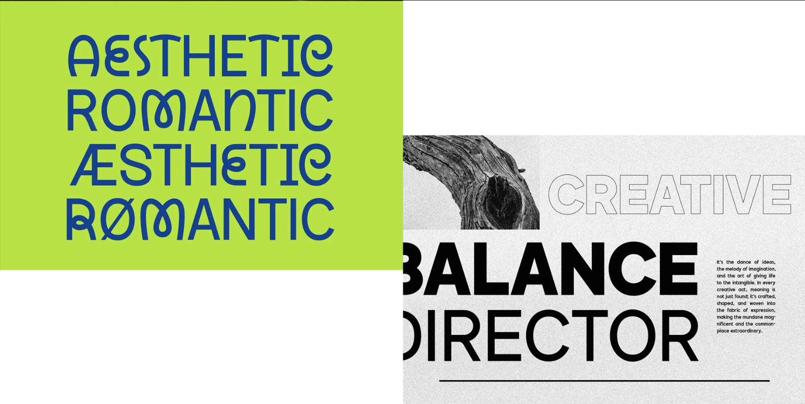
Fonts : Brillante Siempre, Retroma Vibes, Morside
Controlled imperfection creates tension—and tension creates interest.
3. Limit Your Tools
Too many options lead to generic outcomes. Try:
- Using only one typeface
- Working in black and white
- Avoiding templates entirely
Constraints force creativity.
And creativity is where uniqueness lives.
4. Study Outside Design Platforms
If all your inspiration comes from Dribbble, your work will look like Dribbble. Instead, explore:
- Architecture
- Film stills
- Old magazines
- Experimental art

For deeper theory and historical context, you can explore resources like Smashing Magazine, which often dives into design thinking beyond trends. Or even better—observe real life. Texture, chaos, imperfection. That’s where originality hides.
5. Design Something That Feels “Wrong”
This is the real test. If your design feels slightly uncomfortable…
You’re probably onto something. Because originality often feels wrong before it feels right.
The Return of Identity in Design
We’re starting to see a shift. Designers are getting tired of sameness.
They’re craving identity again.
Not just: Clean, Modern, Minimal
but: Personal, Expressive, Distinct
Because in a world where everything looks good,
the only thing that stands out is character.
Final Thoughts
Most designs look the same not because designers lack creativity—but because the system rewards similarity.
Templates, algorithms, trends, and fear all push design toward a safe middle ground. But the designers who stand out? They do something different. Not randomly. Not recklessly. But intentionally. So the next time you design something, ask yourself:
👉 Does this look good…
or does it look like me?