In today’s digital-first marketplace, consumers are exposed to thousands of brand messages every single day. Logos, advertisements, websites, product packaging, and social media content compete for attention in an increasingly crowded landscape. As brands strive to stand out, authenticity has become one of the most valuable qualities a company can communicate. One of the most …
Blog

Why Some Fonts Age Better Than Others
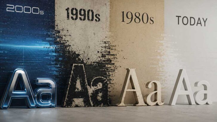
Some fonts age better than others because they prioritize readability, balanced proportions, adaptability, and timeless design principles over temporary trends. Typefaces such as Helvetica, Garamond, and Futura remain popular because they continue to perform effectively across different mediums and design eras. Why Some Fonts Age Better Than Others Every year, thousands of new fonts enter …

Why Your Design Looks Cheap (And How to Fix It)
Let’s be honest—sometimes a design just feels cheap. You can’t always explain it right away, but you know it when you see it.The layout looks messy, the colors feel off, and somehow… it just doesn’t look professional. The frustrating part?It’s often not about your tools, your creativity, or even your experience. It’s about a few …

Best Fonts for Sports Design (Complete Guide for Powerful Branding)
In sports design, typography isn’t just decoration — it’s identity. The right font can instantly communicate strength, speed, aggression, and professionalism. Whether it’s printed on a jersey, used in a team logo, or featured in esports branding, typography plays a critical role in how a brand is perceived. Unlike general-purpose fonts, sports fonts are built …

Why Most Designs Look the Same (And How to Escape It)
The Era of Sameness Scroll through Instagram, Behance, or Dribbble for just five minutes, and you’ll start noticing something unsettling. Everything looks… familiar. The same soft gradients.The same minimal layouts.The same sans-serif typefaces spaced just enough to feel “premium.” It’s not that these designs are bad. In fact, many of them are technically excellent. But …

Typography vs Logo: Which One Actually Builds Stronger Branding?
Branding conversations almost always begin with the logo. It’s the first thing clients ask for, the first thing shown in presentations, and the first thing debated during rebrands. A logo feels tangible, symbolic, and definitive. Typography, on the other hand, is often treated as a supporting element—important, yes, but rarely the star of the show. …

“The Font That Cries”: When Typography Communicates Emotion Better Than an Image
If a picture is worth a thousand words, a font is worth the dozen feelings that arrive before the first sentence even finishes loading. Typography doesn’t sit politely in the background — it nudges, sighs, laughs, and sometimes flat-out sobs on behalf of your brand. In this piece, we’ll unbox how typefaces transmit emotion, why …

Why Modern Brands Are Growing Tired of Minimalism
For more than a decade, minimalism has dominated the branding world. Flat logos, neutral color palettes, clean sans-serif typography, and plenty of white space became the universal formula for “modern” design. From startups to global corporations, everyone followed the same visual playbook. But something has shifted. In recent years, modern brands have started to feel …
Why Luxury Brands Are Still Using Art Deco Style in 2026
In 2026, branding exists in a paradox. On one side, design has never been more accessible. AI tools generate layouts in seconds, minimalism dominates digital interfaces, and trends cycle faster than ever. On the other side, luxury brands face a growing challenge: how to remain distinctive, authoritative, and timeless in a world overflowing with sameness. …
Why Minimalism Feels Luxurious: The Psychology Behind Simplicity
Luxury is often imagined as excess — ornate chandeliers, gold-plated dinnerware, and closets bursting with designer pieces. But in recent years, the opposite aesthetic has stolen the spotlight: minimalism. Clean lines, muted tones, and empty spaces that somehow feel full. The question is simple (pun intended): why does stripping things away feel richer than adding …