For more than a decade, minimalism has dominated the branding world. Flat logos, neutral color palettes, clean sans-serif typography, and plenty of white space became the universal formula for “modern” design. From startups to global corporations, everyone followed the same visual playbook.
But something has shifted.
In recent years, modern brands have started to feel fatigued by minimalism. What once felt fresh, premium, and forward-thinking now often feels predictable—sometimes even forgettable. This growing dissatisfaction isn’t about rejecting simplicity altogether, but about realizing that too much minimalism has created a sea of sameness.
So why exactly are brands moving away from minimalism, and what’s replacing it?
The Rise of Minimalism: Why It Worked So Well
Minimalism didn’t become popular by accident.
In the early 2010s, digital platforms exploded. Websites, mobile apps, and social media demanded clean, readable, and responsive design systems. Minimalism solved several problems at once:
- Faster load times
- Better readability on small screens
- Easier scalability across platforms
- A sense of modernity and professionalism
Minimalist things made everything easier and more efficient
Brands that embraced minimalism felt efficient and trustworthy. In contrast to the noisy, over-designed aesthetics of the early 2000s, minimalism was a breath of fresh air.
It also aligned perfectly with Silicon Valley culture: clarity, functionality, and speed. A simple logo meant adaptability. A neutral palette meant global appeal.
For a while, it worked beautifully.
When Minimalism Becomes Monotony
The problem didn’t start with minimalism itself—it started with overuse.
As more brands adopted the same visual language, differences began to blur. Today, countless companies share:
- Rounded sans-serif logos
- Black-and-white color schemes
- Generic geometric symbols
- Near-identical website layouts
Scroll through tech startups, fintech apps, wellness brands, or DTC companies, and you’ll notice how interchangeable many of them feel.
This phenomenon is often referred to as brand homogenization.
When every brand tries to look clean, neutral, and inoffensive, they lose the very thing branding is supposed to protect: distinctiveness.
At some points, minimalist feels boring to use
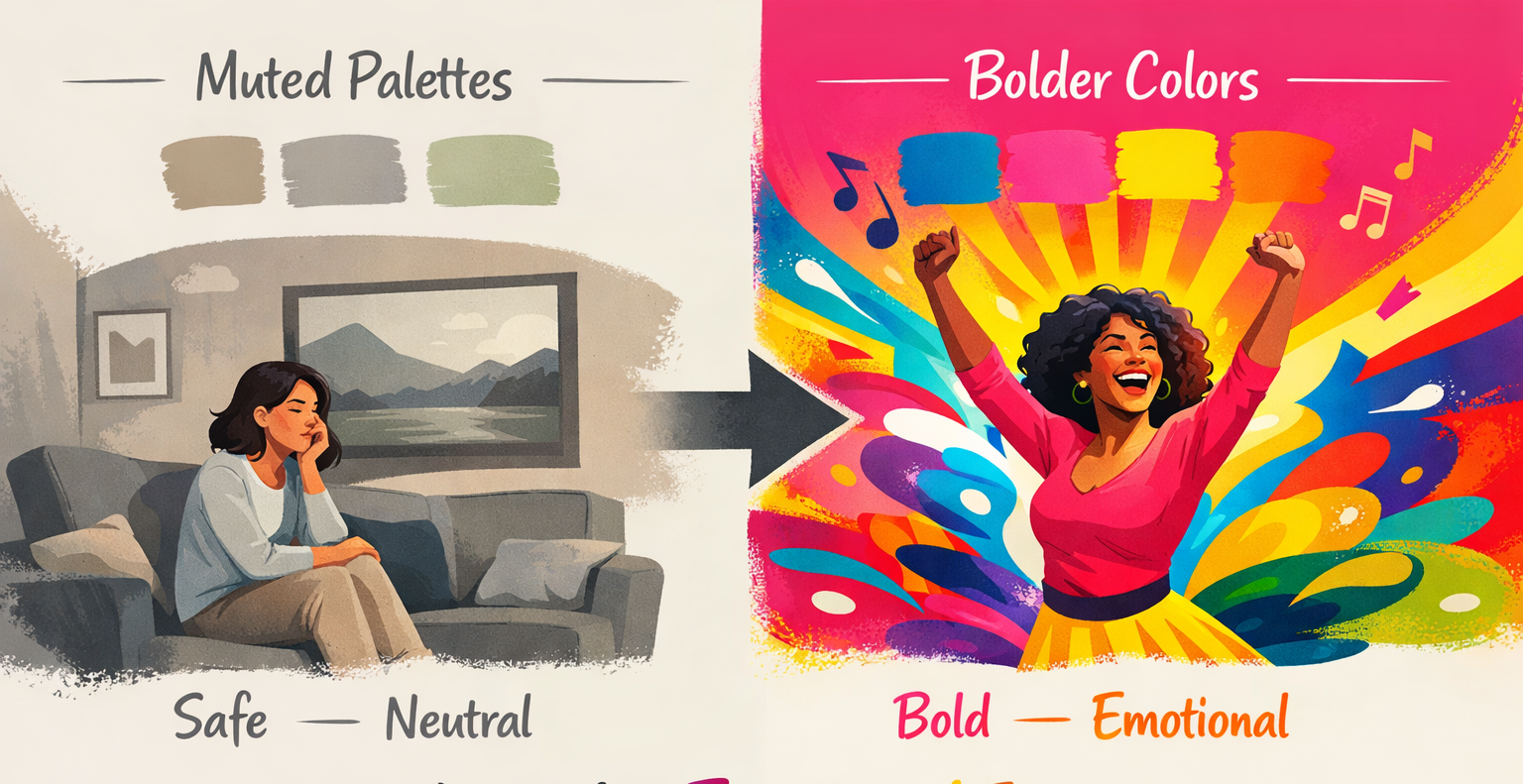
Modern Consumers Crave Personality, Not Perfection
Today’s audiences are more visually literate than ever. They scroll faster, compare more, and remember less. In that environment, bland design doesn’t feel “safe”—it feels invisible.
Modern consumers are drawn to brands that feel:
- Human
- Expressive
- Opinionated
- Emotionally resonant
Minimalism often strips away too much personality in the pursuit of neutrality. While that neutrality once signaled trust, it now risks signaling lack of character.
According to branding insights from Nielsen Norman Group, emotional connection plays a major role in brand recall and user trust. Visual identity isn’t just about clarity—it’s about memory.
Minimalism alone struggles to create emotional depth.
The Algorithm Problem: Looking the Same Hurts Visibility
Another reason brands are moving away from extreme minimalism is algorithmic reality.
On social media platforms like Instagram, TikTok, and even LinkedIn, bold and expressive visuals outperform subtle ones. Feeds are crowded. Attention spans are short. If your brand visuals don’t stop the scroll, you lose.
Minimalist branding often performs poorly in:
- Thumbnail-driven platforms
- Short-form video previews
- Visual-first discovery algorithms

If the scroll stop, you win
Brands now need visual systems that are recognizable at a glance, even at small sizes. That often means stronger typography, bolder colors, and more distinctive graphic elements—things minimalism traditionally avoids.
Minimalism vs. Meaning
Minimalism focuses on removal. But branding is about communication.
Many modern brands realized they removed too much. When visual identity becomes overly stripped down, it can lose cultural signals, storytelling layers, and emotional cues.
Ask yourself:
- Can your brand be recognized without the logo?
- Does your typography say anything about your values?
- Would your visuals still feel unique if your brand name were removed?
If the answer is “no,” minimalism may have gone too far.
The Return of Character-Driven Design
Instead of abandoning minimalism entirely, brands are evolving it.
What we’re seeing now is not maximalism for the sake of chaos, but character-driven design. This approach blends clarity with expression.
Key characteristics include:
1. Expressive Typography
Brands are investing in custom or display typefaces that feel distinctive. Typography is no longer just a vessel for text—it’s a brand voice.
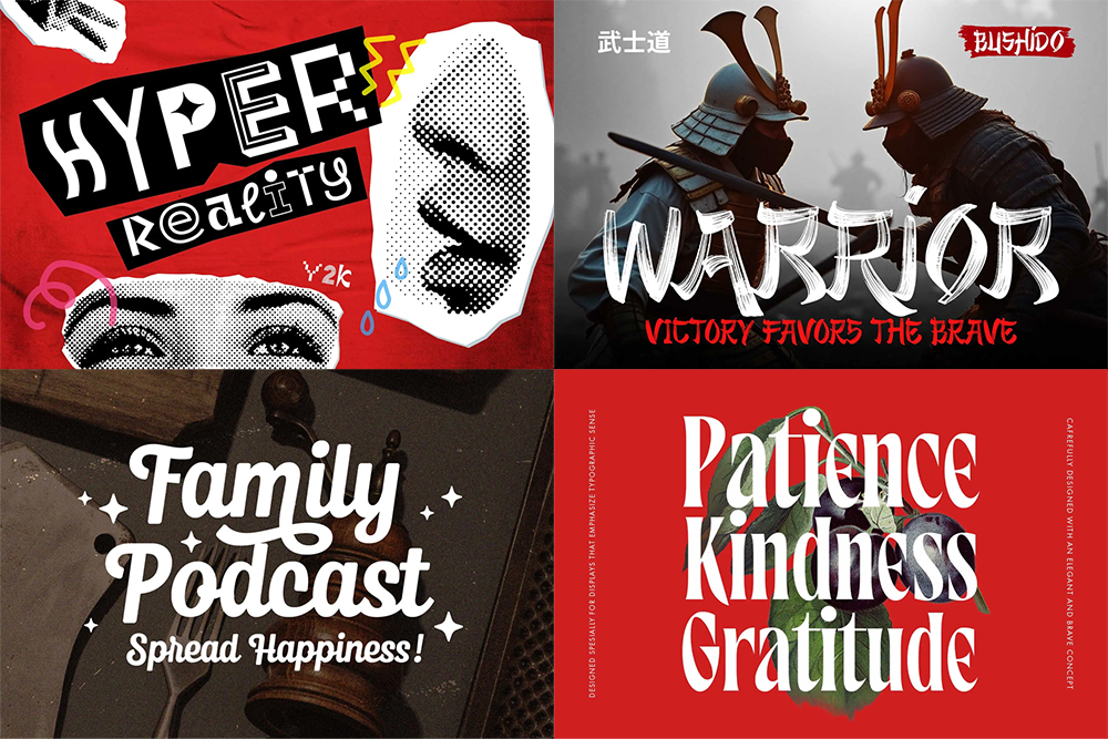
Expressive typography makes difference and characteristic.
Fonts : Maltiner, Sunday Balerina, Unpopular Montage, Zenjirou
2. Bolder Color Systems
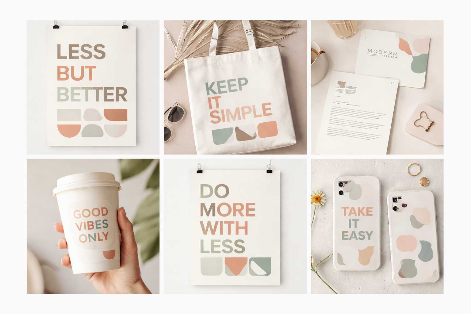
Muted palettes are being replaced or enhanced with confident accent colors. Color is used strategically to evoke emotion, not just neutrality.
3. Imperfection and Texture
Grain, noise, hand-drawn elements, and organic shapes are making a comeback. These imperfections humanize the brand.
4. Cultural Context
Brands are leaning into specific subcultures, communities, or attitudes instead of trying to appeal to everyone.
Luxury Brands Proved Minimalism Isn’t Enough
Interestingly, luxury brands were among the first to expose minimalism’s limits.
As many luxury houses simplified their logos to near-identical sans-serif wordmarks, backlash followed. Consumers complained about loss of heritage, identity, and craftsmanship.
Luxury depends heavily on story, legacy, and symbolism. When visual identities became too generic, brands risked looking mass-produced rather than premium.
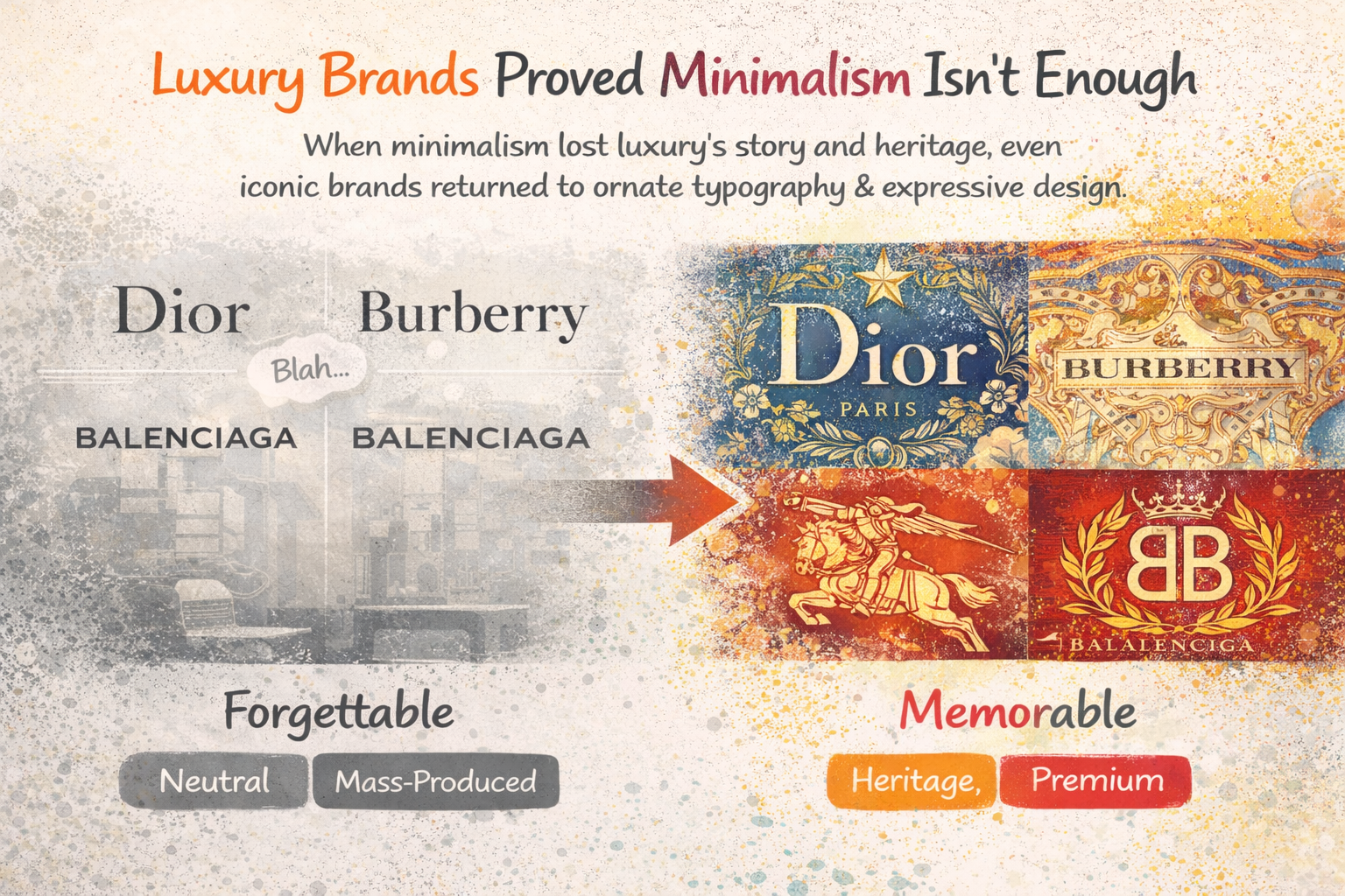
This shift has pushed even high-end brands to reintroduce ornamentation, typography details, and expressive layouts—proving that simplicity alone does not equal sophistication.
Branding Is No Longer About Being Safe
Minimalism was safe. And that was its strength.
But today, safe branding often means forgettable branding.
Modern brands are operating in hyper-competitive markets. Being neutral no longer guarantees trust. Instead, clarity must be paired with confidence. Simplicity must be paired with voice.
The brands winning today are not the cleanest—they’re the clearest about who they are.
What This Means for Designers and Brand Owners
If you’re building or rebranding a modern brand, the takeaway isn’t “ditch minimalism.”
The takeaway is this:
Minimalism should be a foundation, not a personality.
Ask deeper questions:
- What does this brand stand for?
- What emotion should people feel?
- What visual elements can only belong to this brand?
Design systems should simplify communication—not erase identity.
Conclusion: From Minimal to Meaningful
Brands aren’t bored with minimalism because it’s bad. They’re bored because it’s been used without intention.
In a world flooded with clean logos and neutral interfaces, meaning has become the new differentiator. Expression, character, and emotional clarity are what cut through the noise.
The future of branding isn’t louder—it’s more intentional.
And sometimes, that means adding back what minimalism took away.