In sports design, typography isn’t just decoration — it’s identity. The right font can instantly communicate strength, speed, aggression, and professionalism. Whether it’s printed on a jersey, used in a team logo, or featured in esports branding, typography plays a critical role in how a brand is perceived.
Unlike general-purpose fonts, sports fonts are built with one main goal: visibility and impact. They need to be readable from a distance, recognizable in motion, and strong enough to carry the energy of competition. That’s why most sports typography leans toward bold weights, condensed structures, and geometric consistency.
In this guide, we’ll explore the best fonts for sports design — including powerful typefaces you can use for jerseys, logos, and branding — and how to choose the right one for your project.
1. Bold & Aggressive Fonts (For Maximum Impact)
If your goal is to create a design that feels powerful, loud, and dominant, bold fonts are the way to go. These typefaces are designed to grab attention instantly and project strength — perfect for competitive teams and high-energy branding.
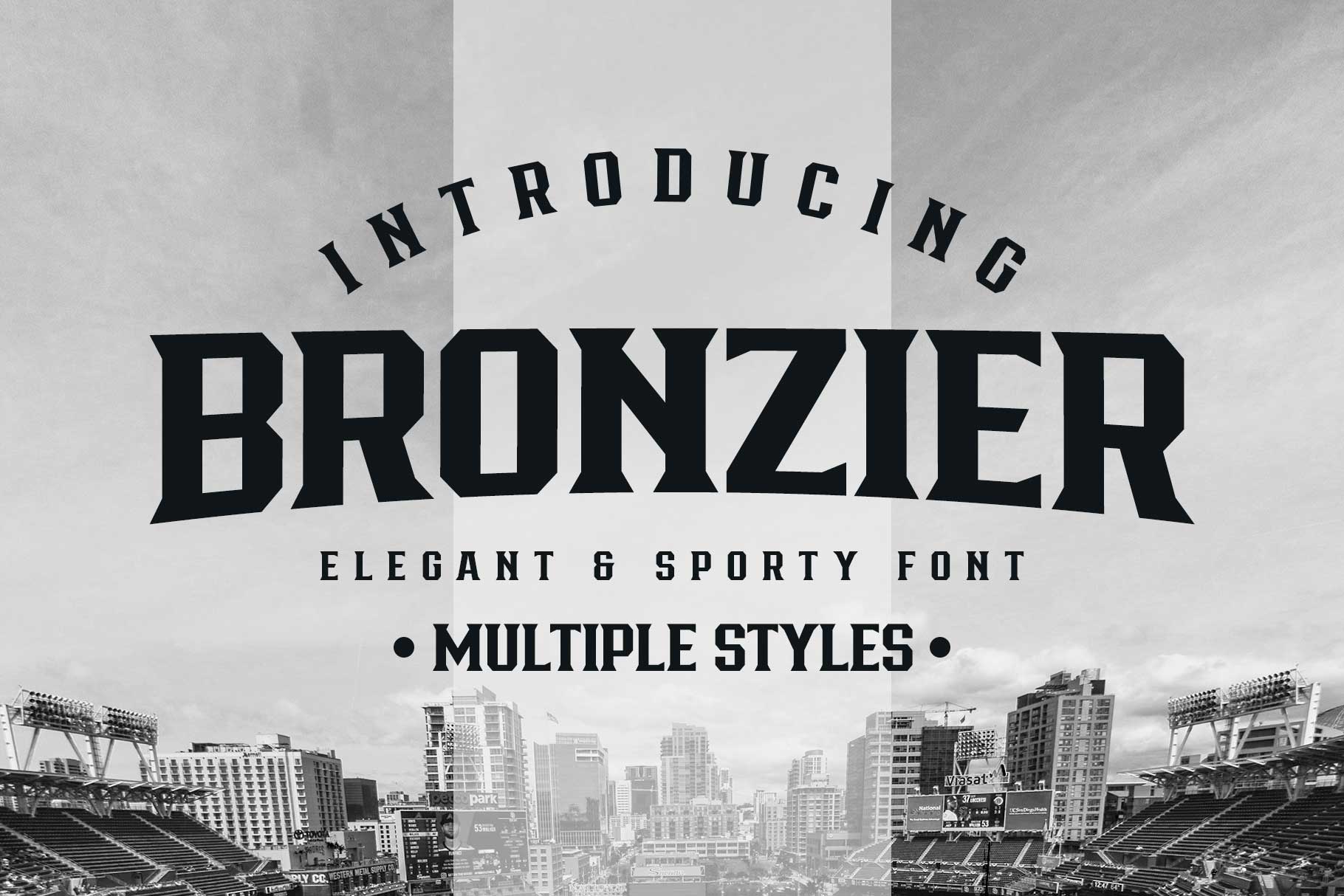
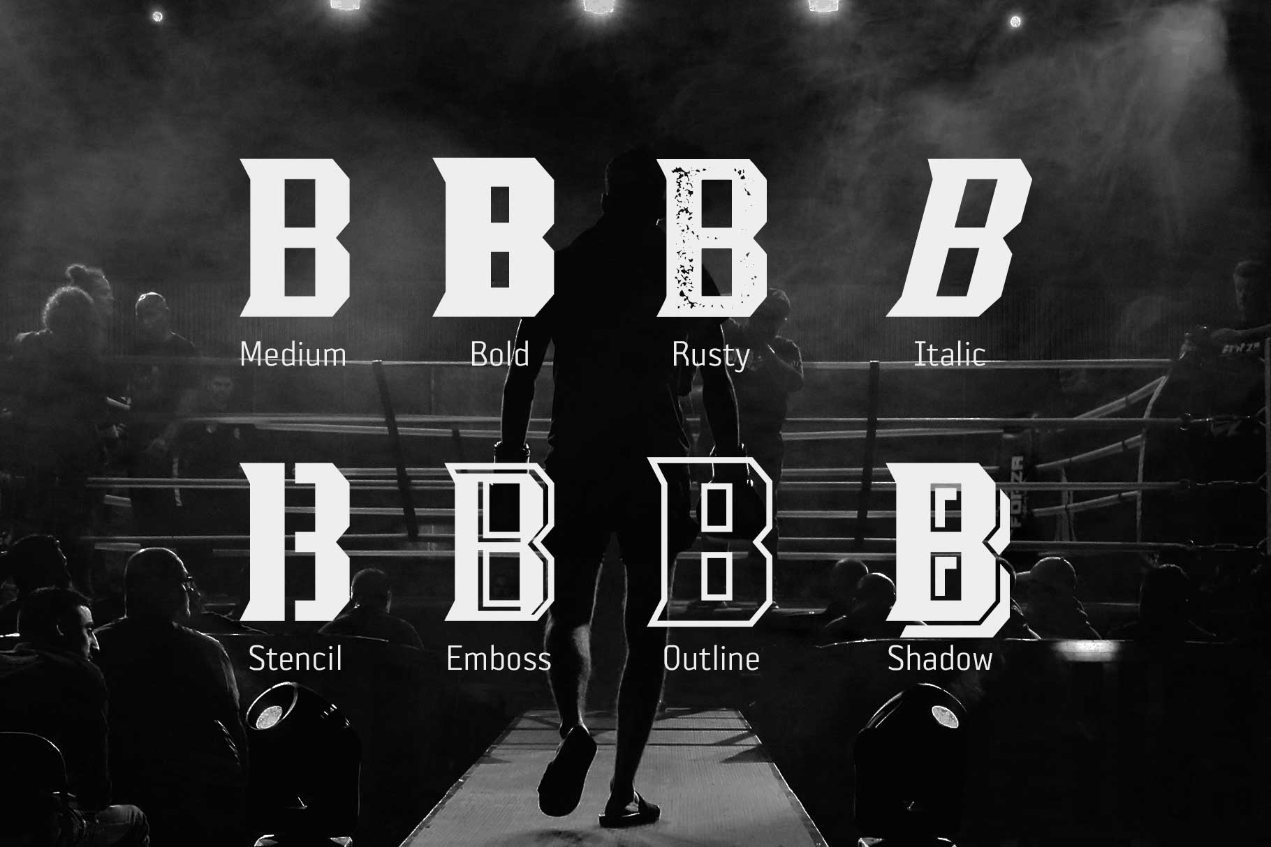
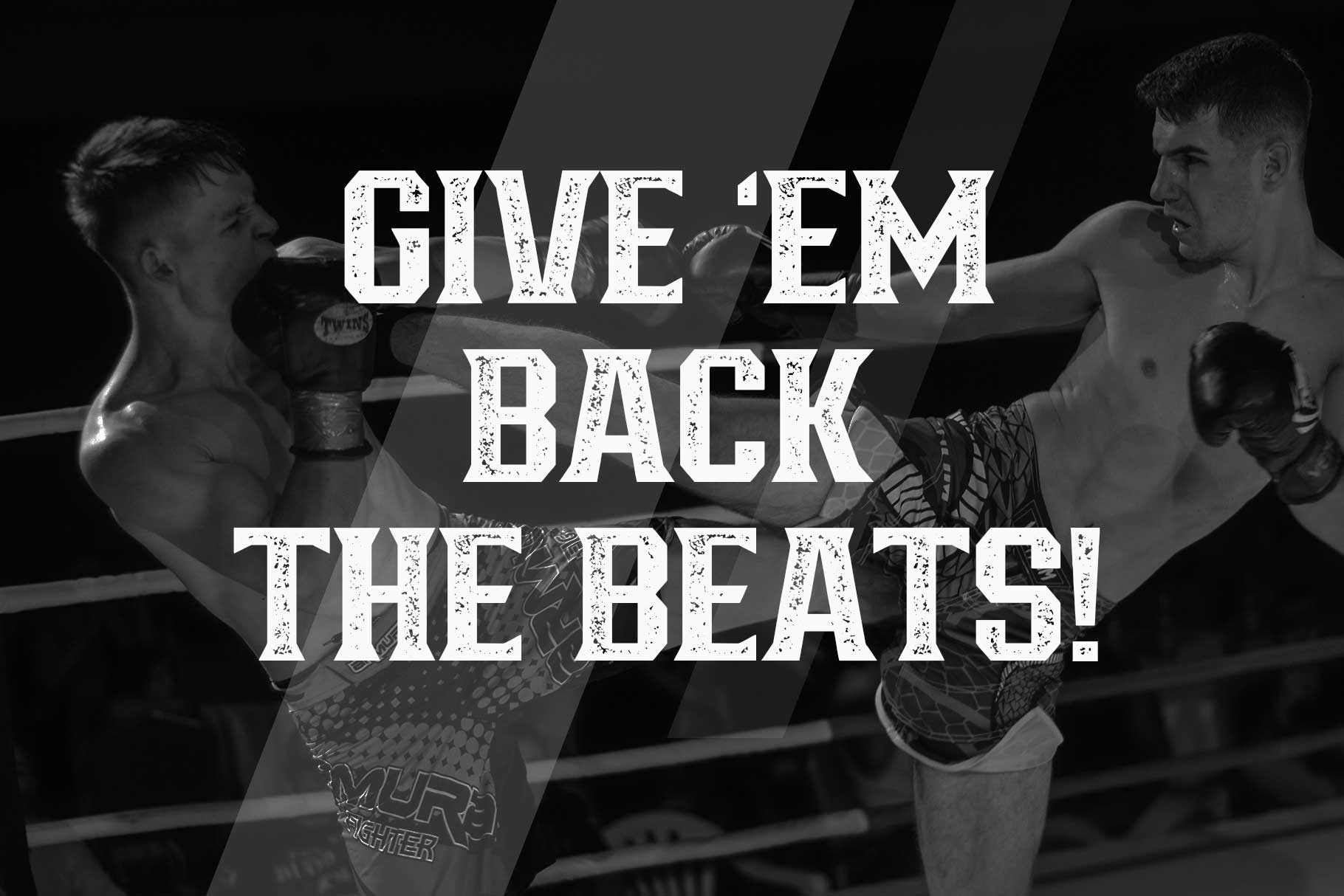
Bronzier
Bronzier is a heavy display font with a commanding presence. Its thick strokes and strong structure make it ideal for team logos, posters, and bold headlines. The font carries a rugged personality that fits perfectly with sports that emphasize power and intensity.
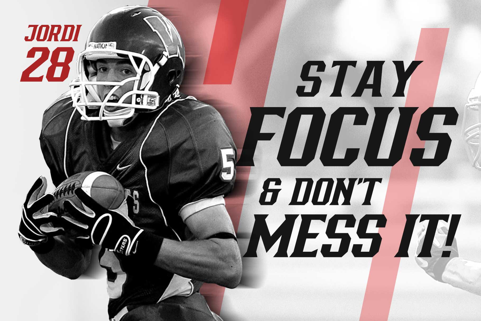
Wargate
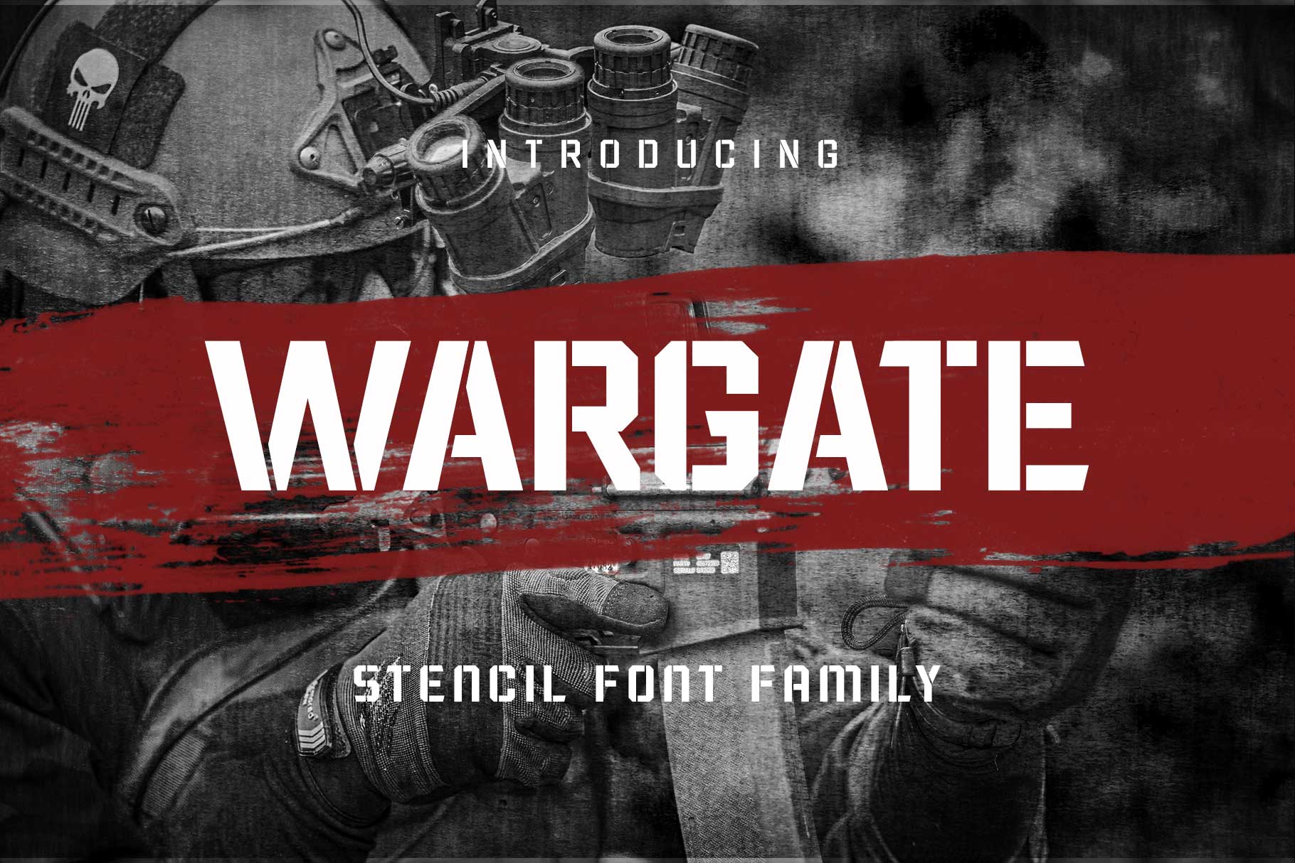
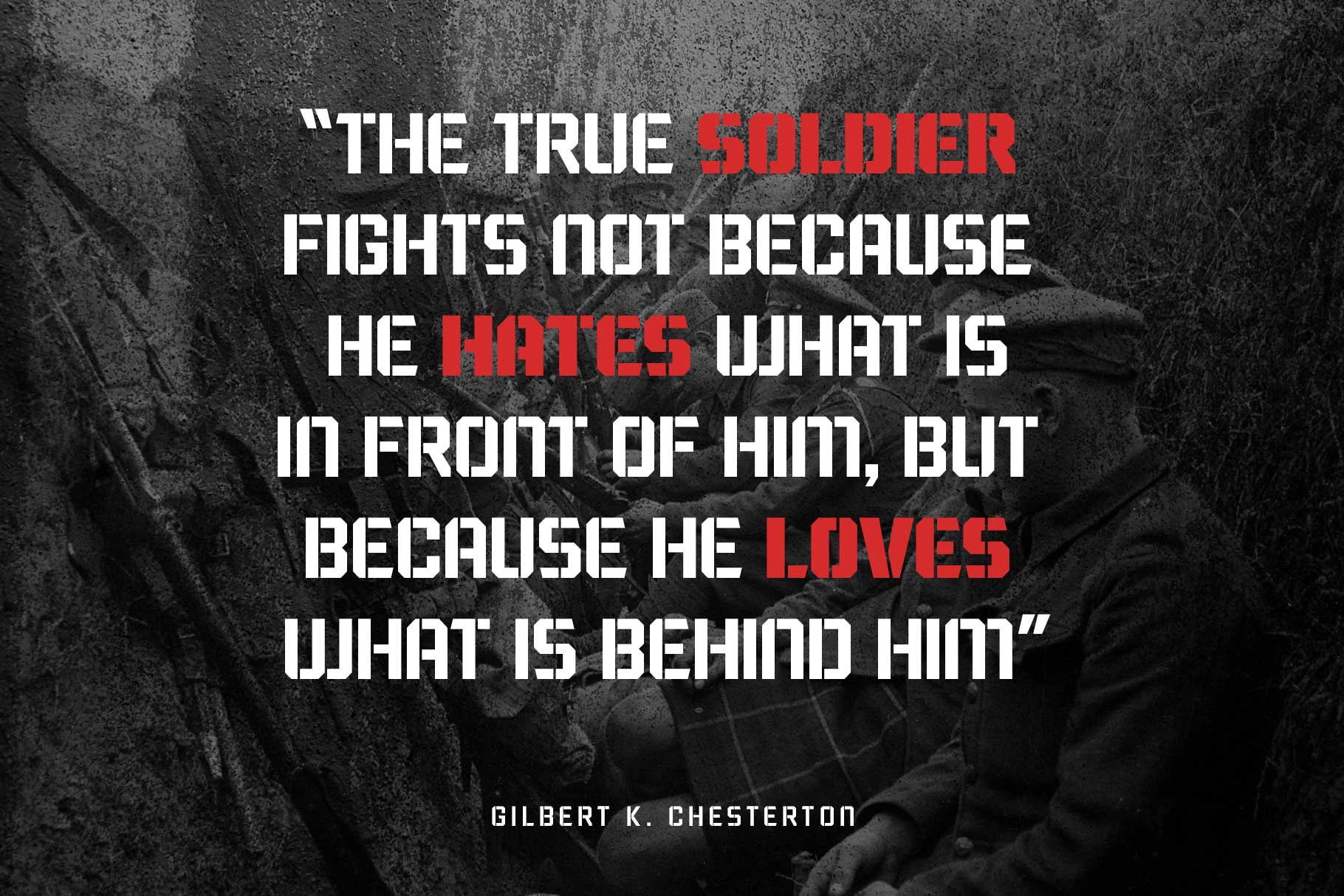
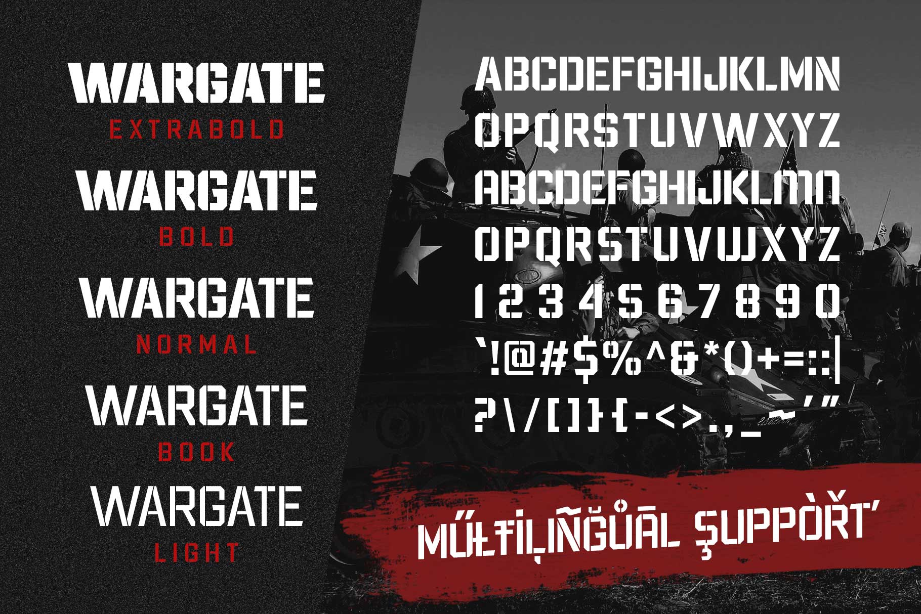
Wargate brings a sharp, tactical aesthetic. With its angular cuts and aggressive form, it’s perfect for esports teams, military-themed branding, or competitive gaming identities. It feels strategic, calculated, and intimidating — exactly what you want in competitive visuals.
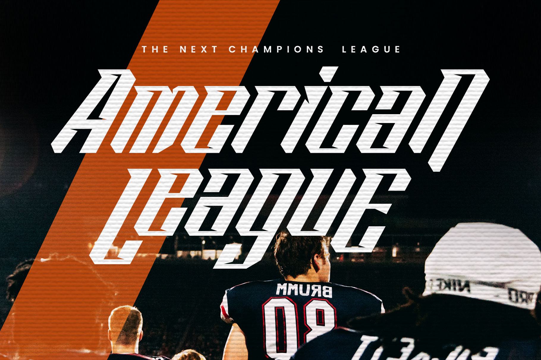
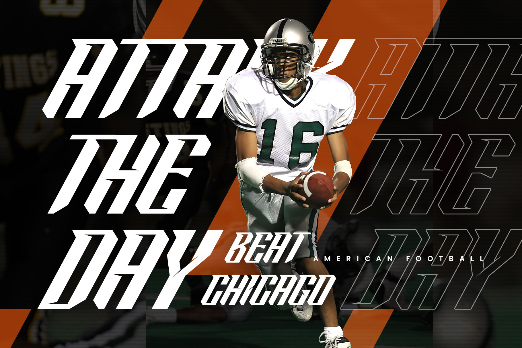
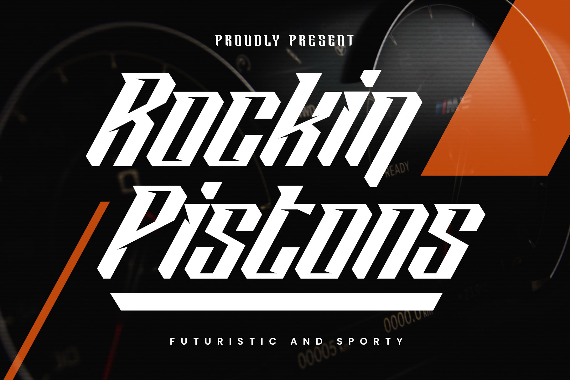
Rockin Pistons delivers a bold yet playful energy. It’s especially suitable for basketball branding, street-style sports visuals, and merchandise design. Compared to more serious fonts, this one adds character while still maintaining strong readability.

Use bold fonts when you want your design to feel fearless, energetic, and impossible to ignore.
2. Condensed & Professional Fonts (For Jerseys & Numbers)
Condensed fonts are a staple in sports design — especially for jerseys. Why? Because they allow designers to use large, readable text without taking up too much horizontal space.
This makes them perfect for:
- jersey numbers
- player names
- team uniforms
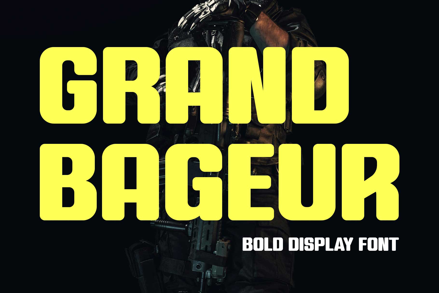
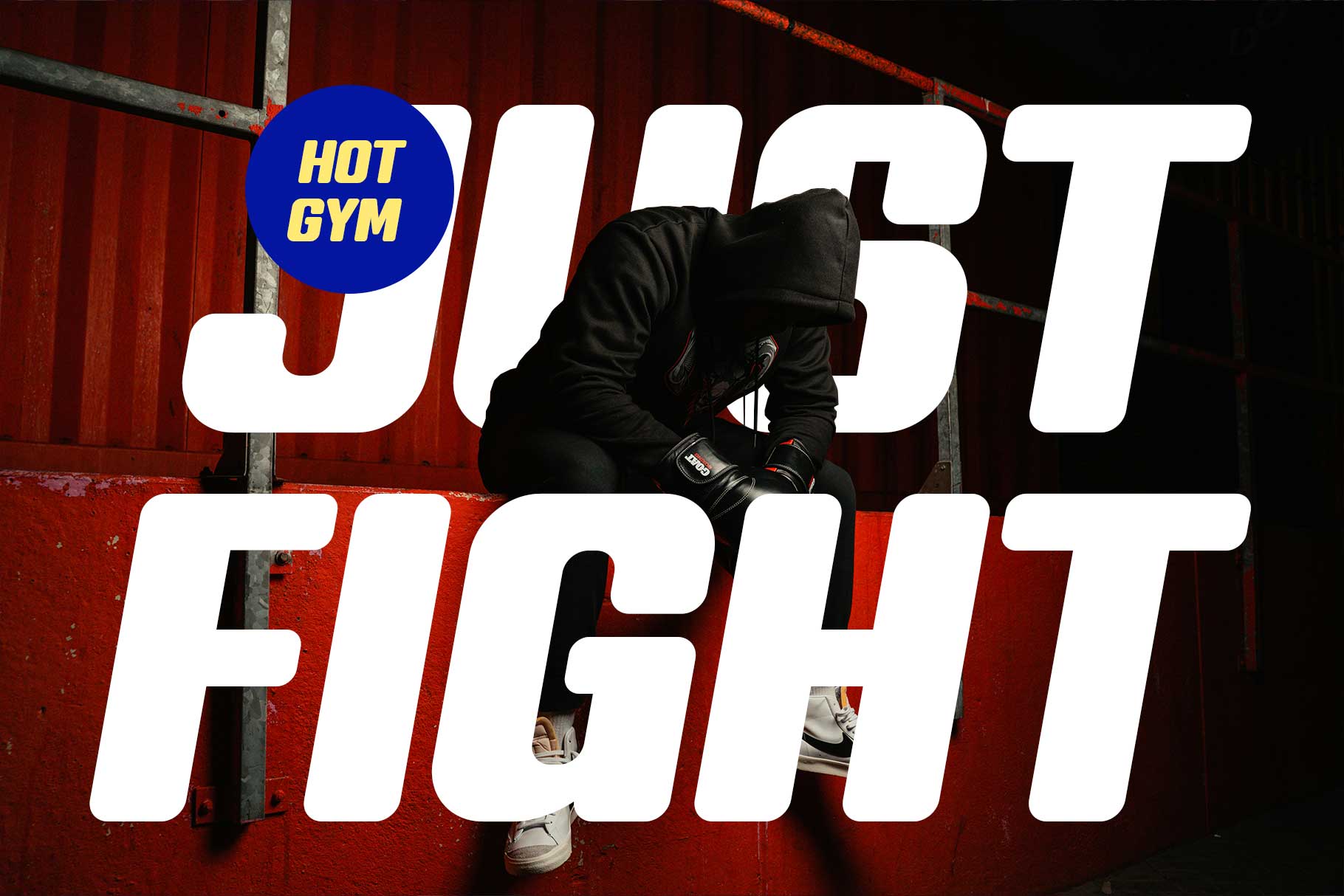
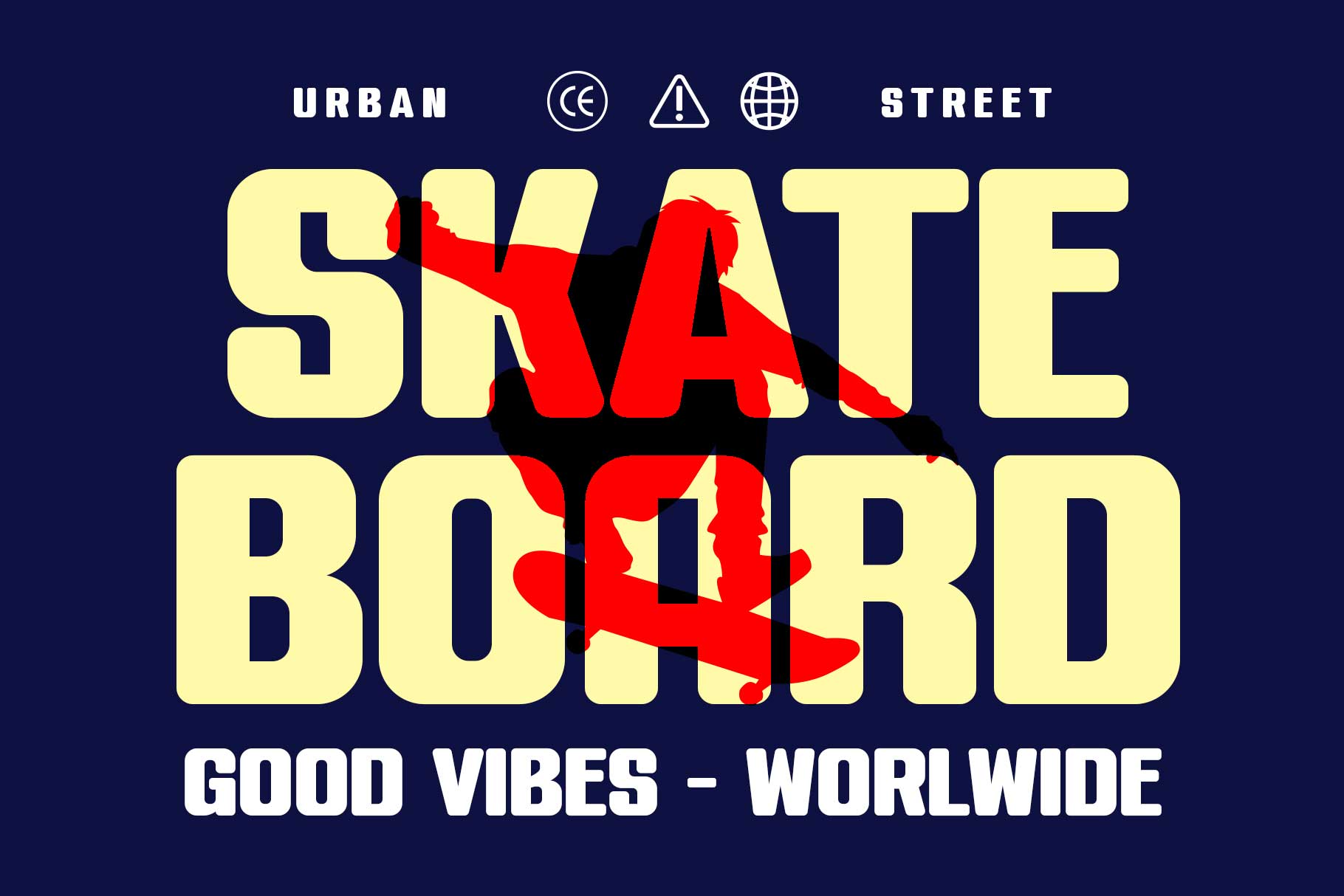
Grand Bageur Elegant Condensed
This font combines elegance with athletic structure. It’s perfect for premium sports branding, fashion-forward teams, or high-end merchandise. If you want your design to feel classy but still sporty, this is a strong choice.

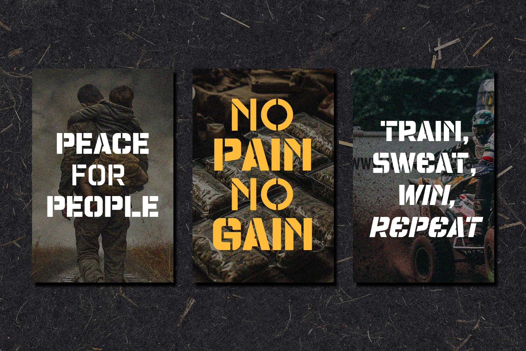
Champions Stencil
Champions Stencil delivers a tough, industrial look. The stencil style gives it a military and battle-ready vibe, making it ideal for teams that want to project resilience and strength. It works great for jerseys, training gear, and bold graphics.

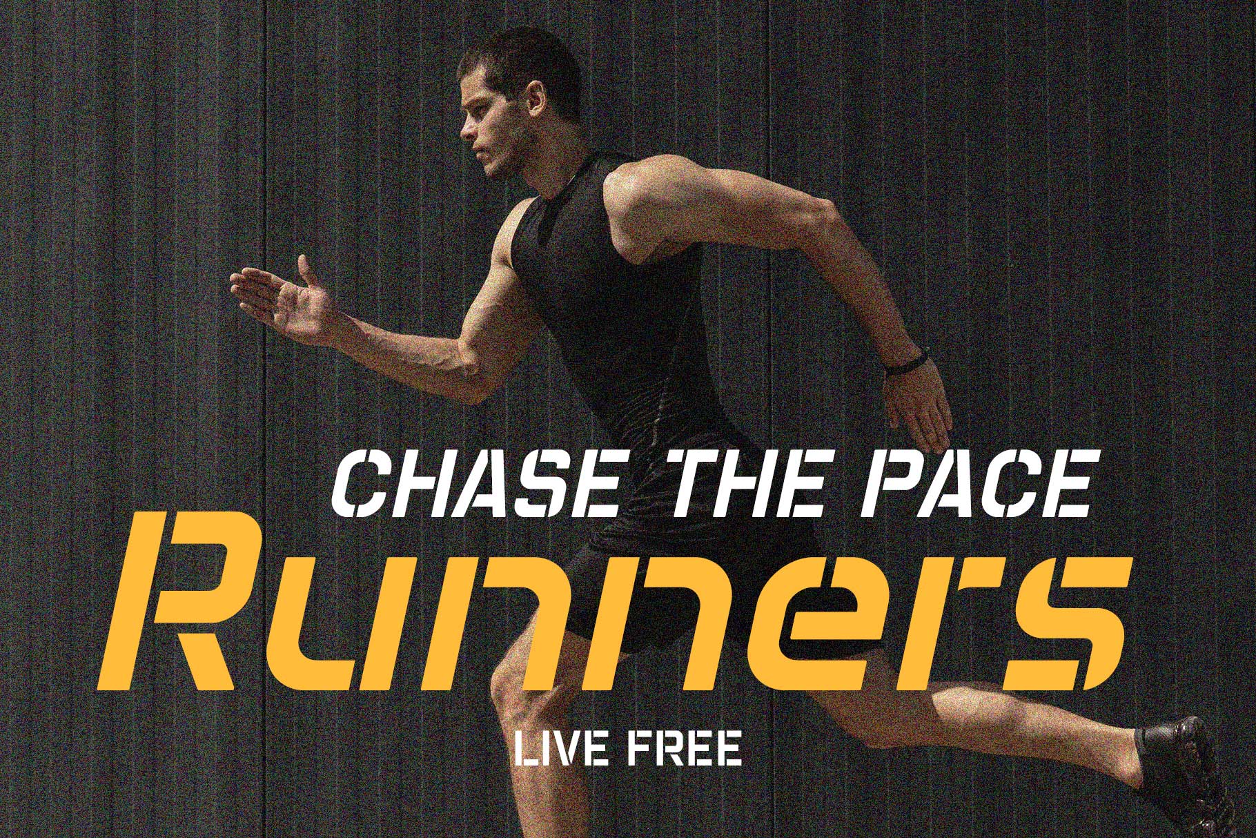
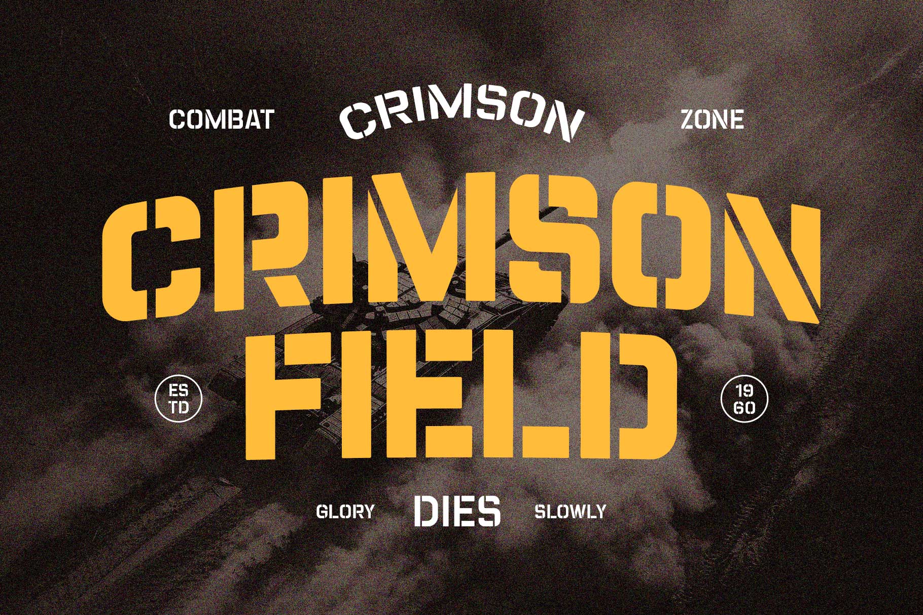
Condensed fonts are the best choice when space is limited but clarity is critical.
3. Futuristic Sports Fonts (For Esports & Modern Branding)
As sports evolve — especially in the digital space — typography follows. Futuristic fonts are increasingly popular in esports and modern athletic branding because they communicate innovation, speed, and technology.
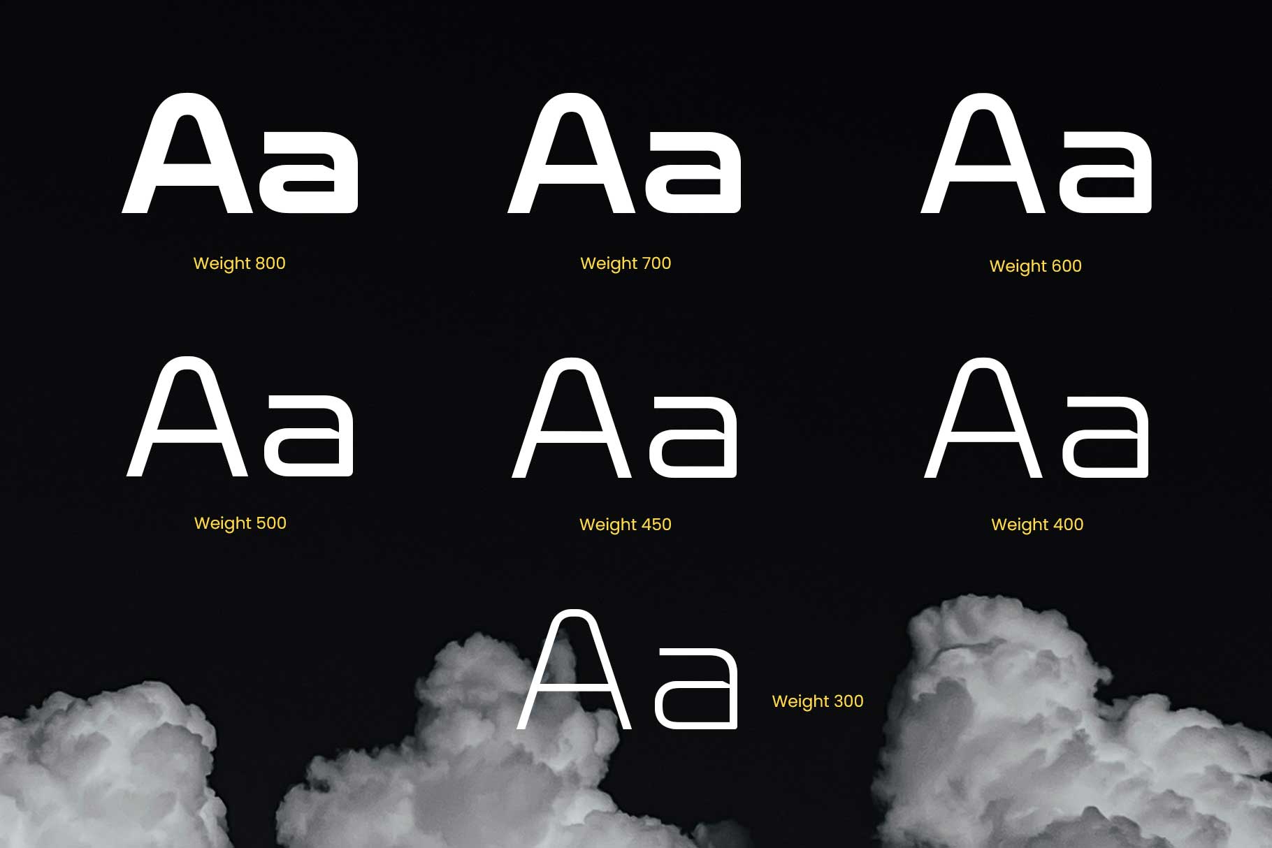
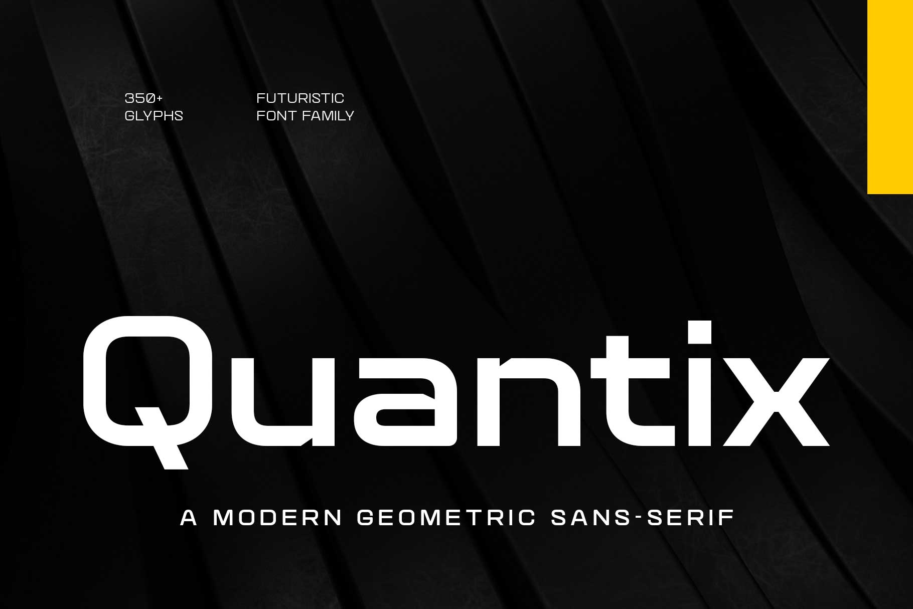
Quantix
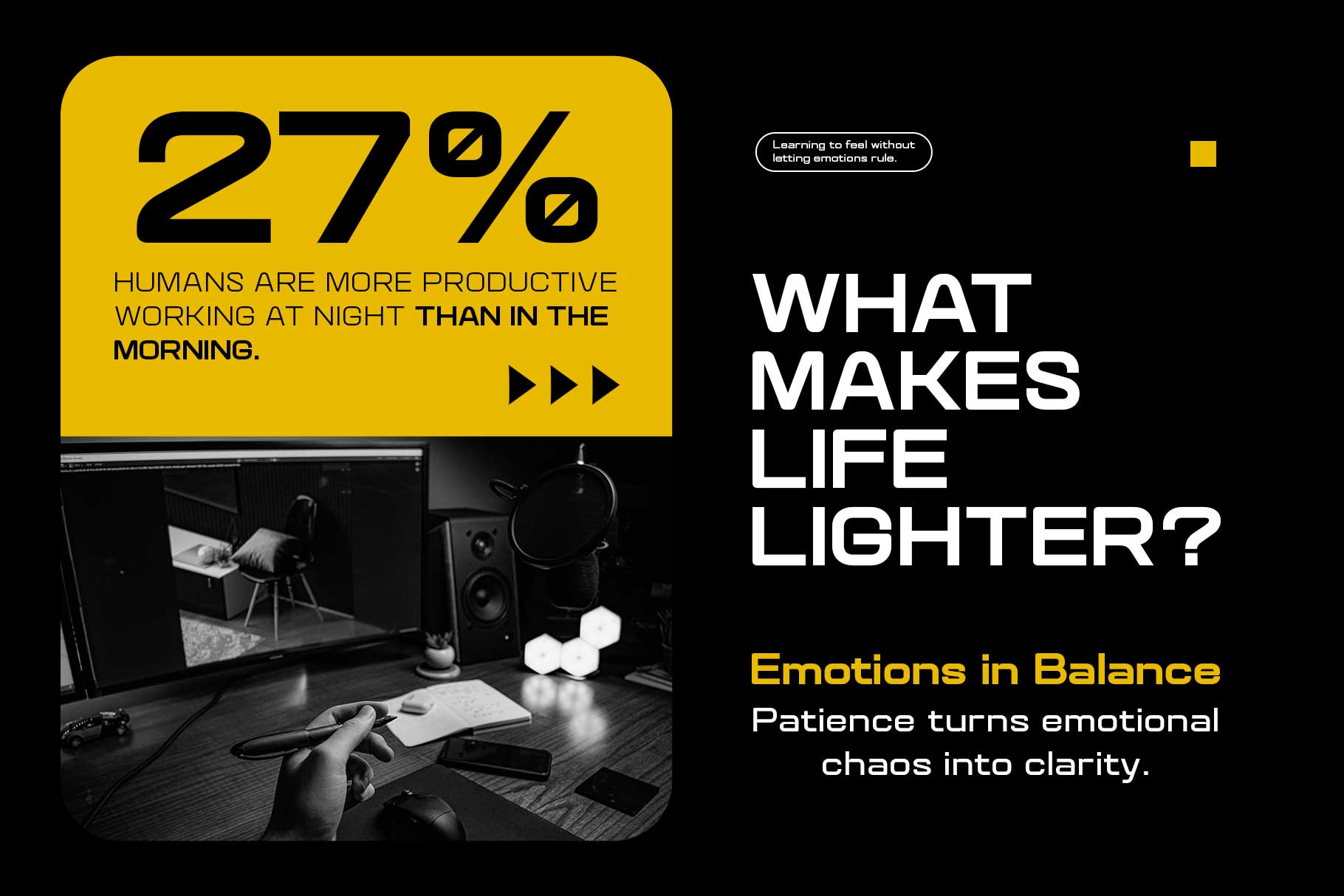
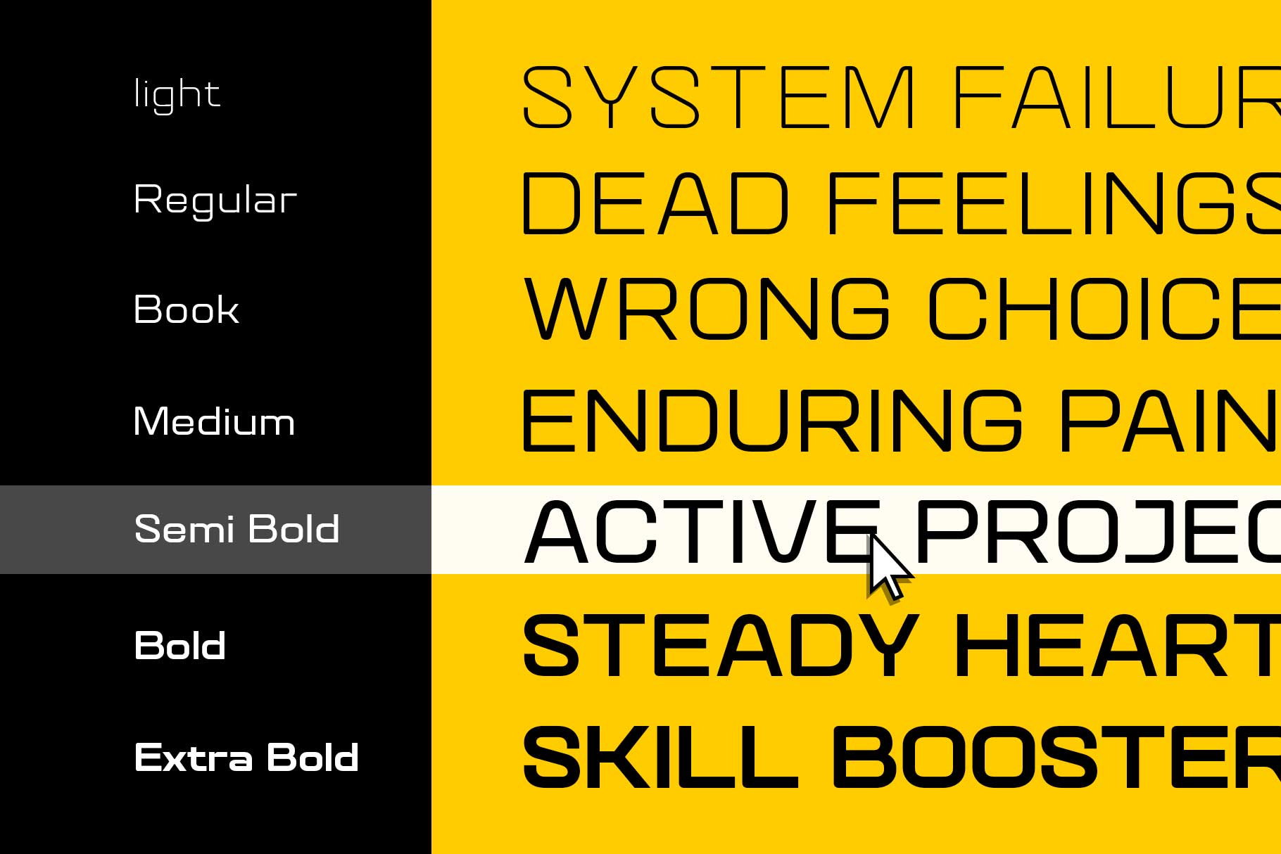
Quantix is clean, sharp, and highly modern. It’s ideal for esports teams, tech-driven brands, and digital-first identities. The geometric construction gives it a precise and professional feel.
Siegra
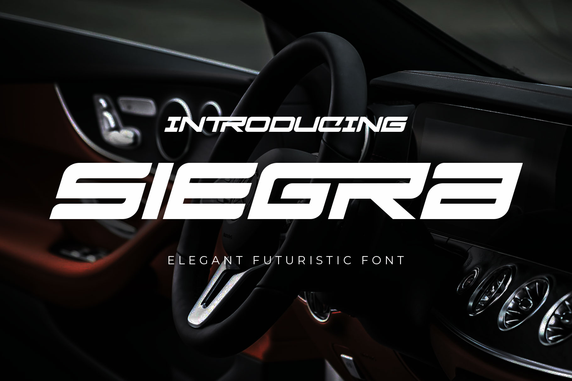
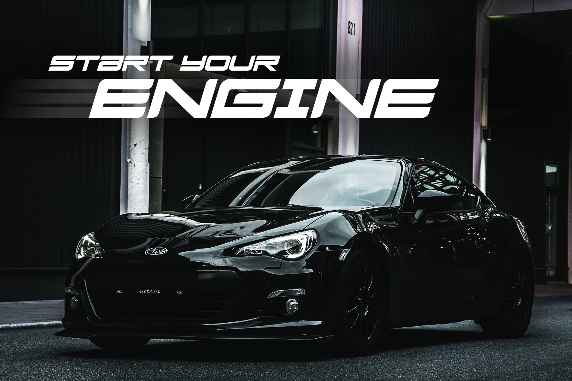
Siegra blends sporty energy with a technological edge. It’s versatile enough for both traditional sports branding and modern athletic visuals, making it a flexible choice for hybrid designs.

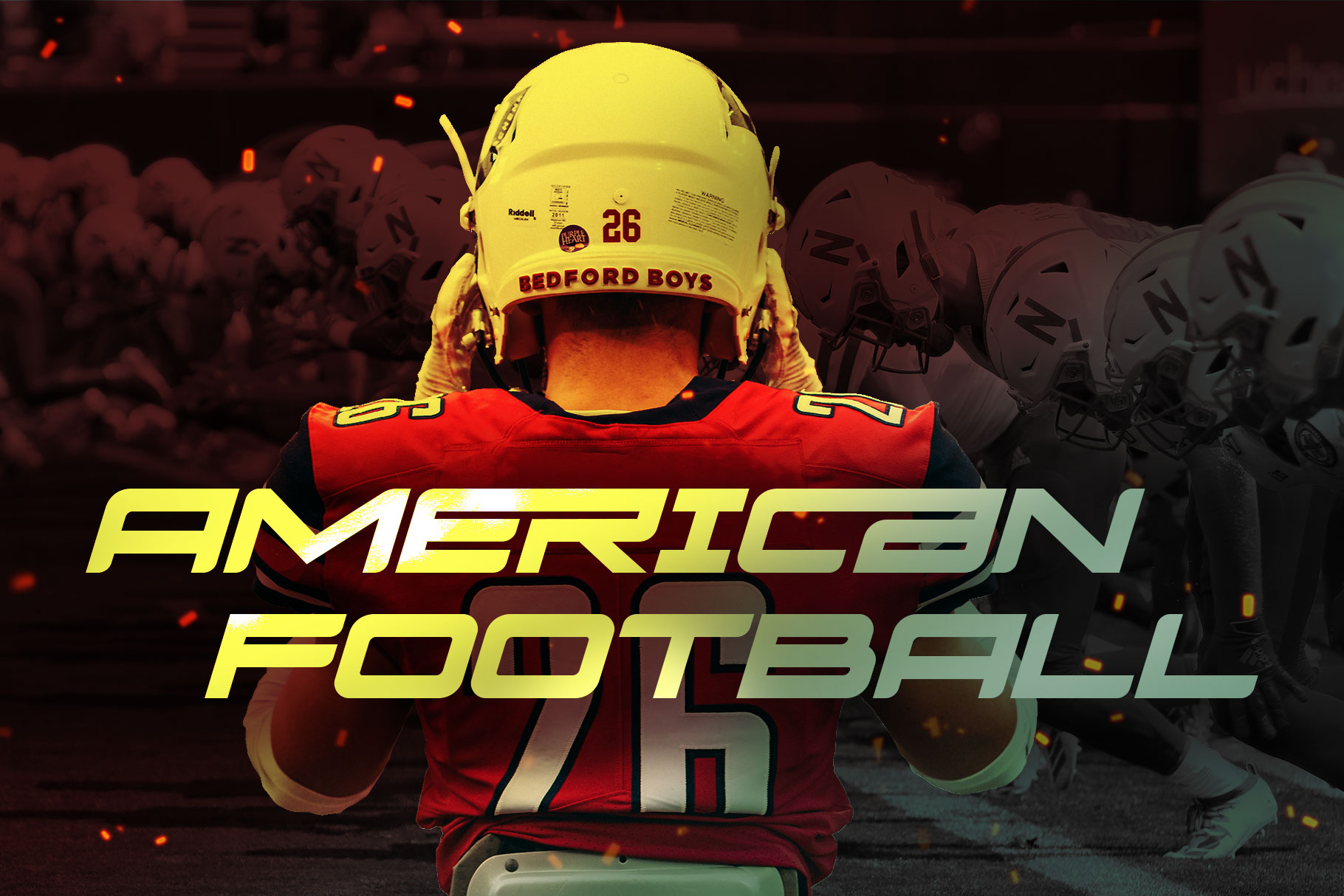
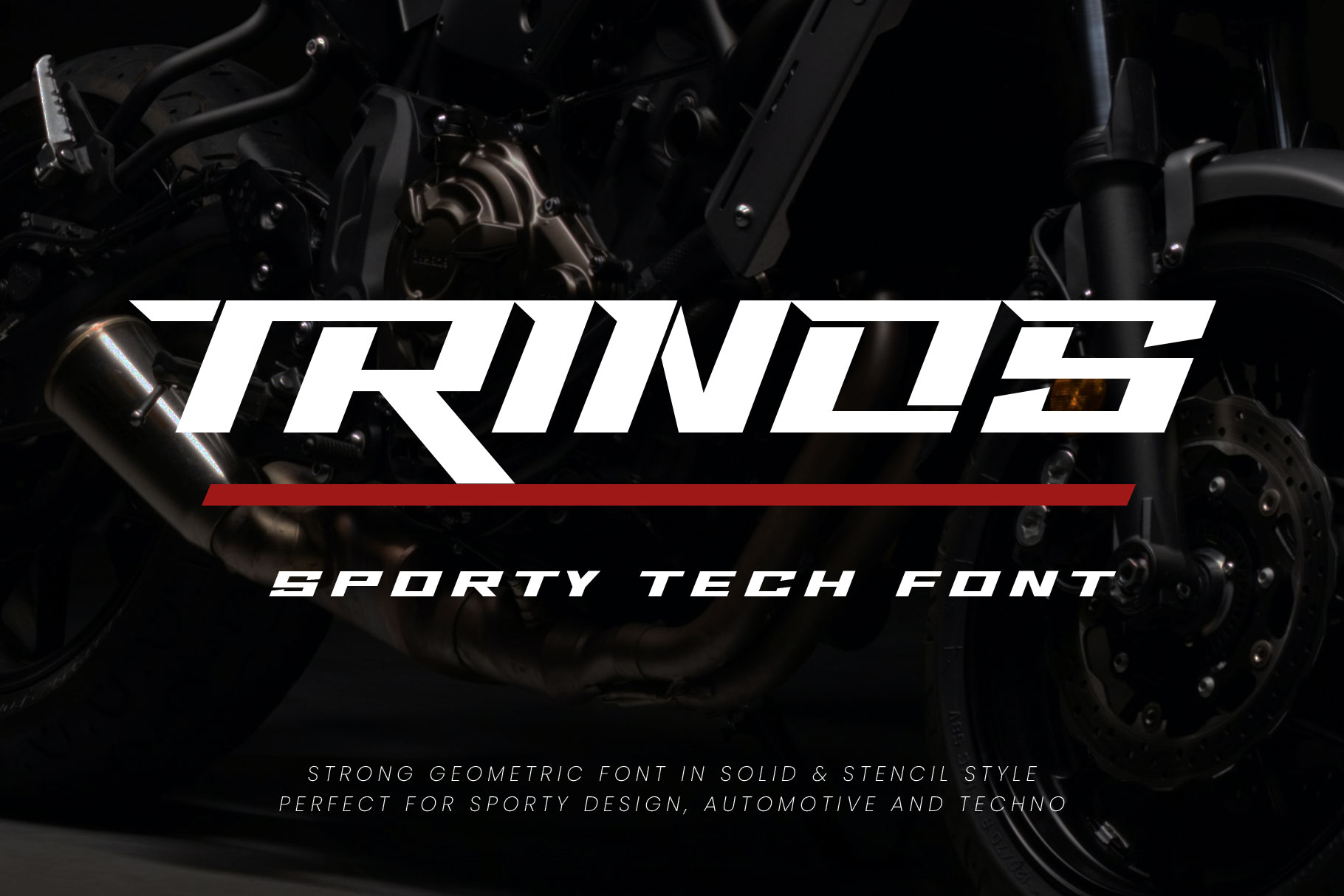
Trinos
Trinos leans into speed and sleekness. Its streamlined forms make it perfect for fast-paced graphics, gaming overlays, and dynamic branding systems.
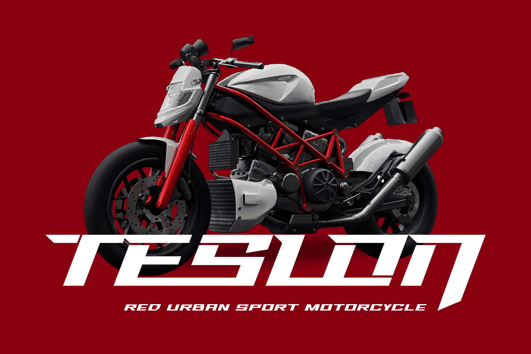
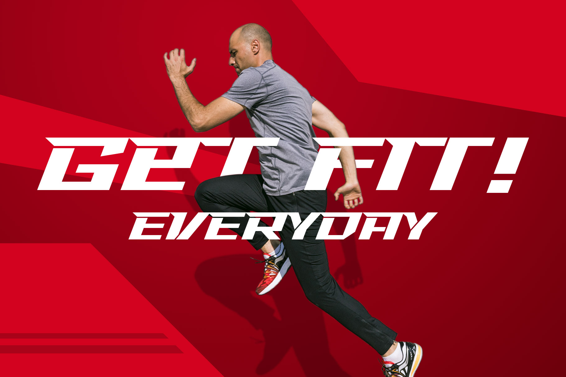
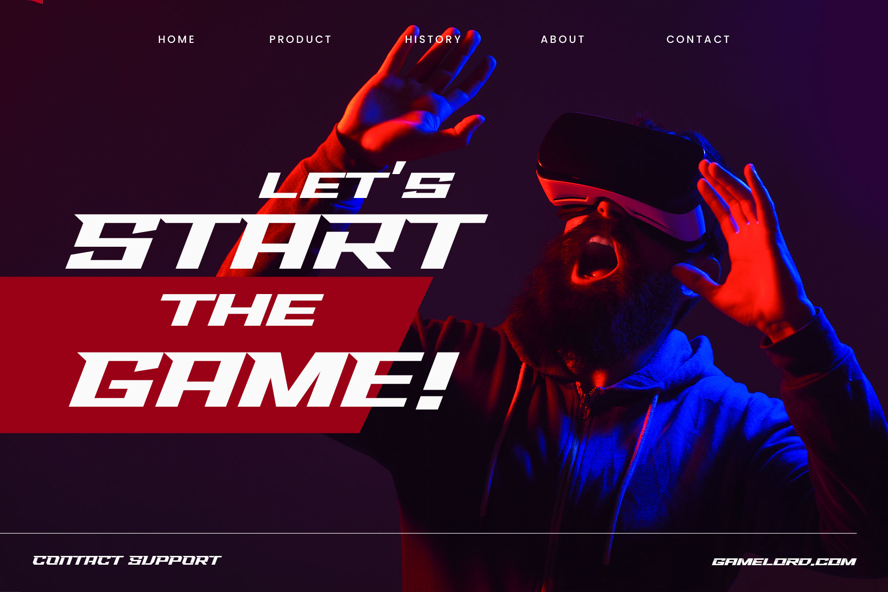
Use futuristic fonts when your design needs to feel modern, digital, and forward-thinking.
4. Speed & Motion Fonts (For Dynamic Designs)
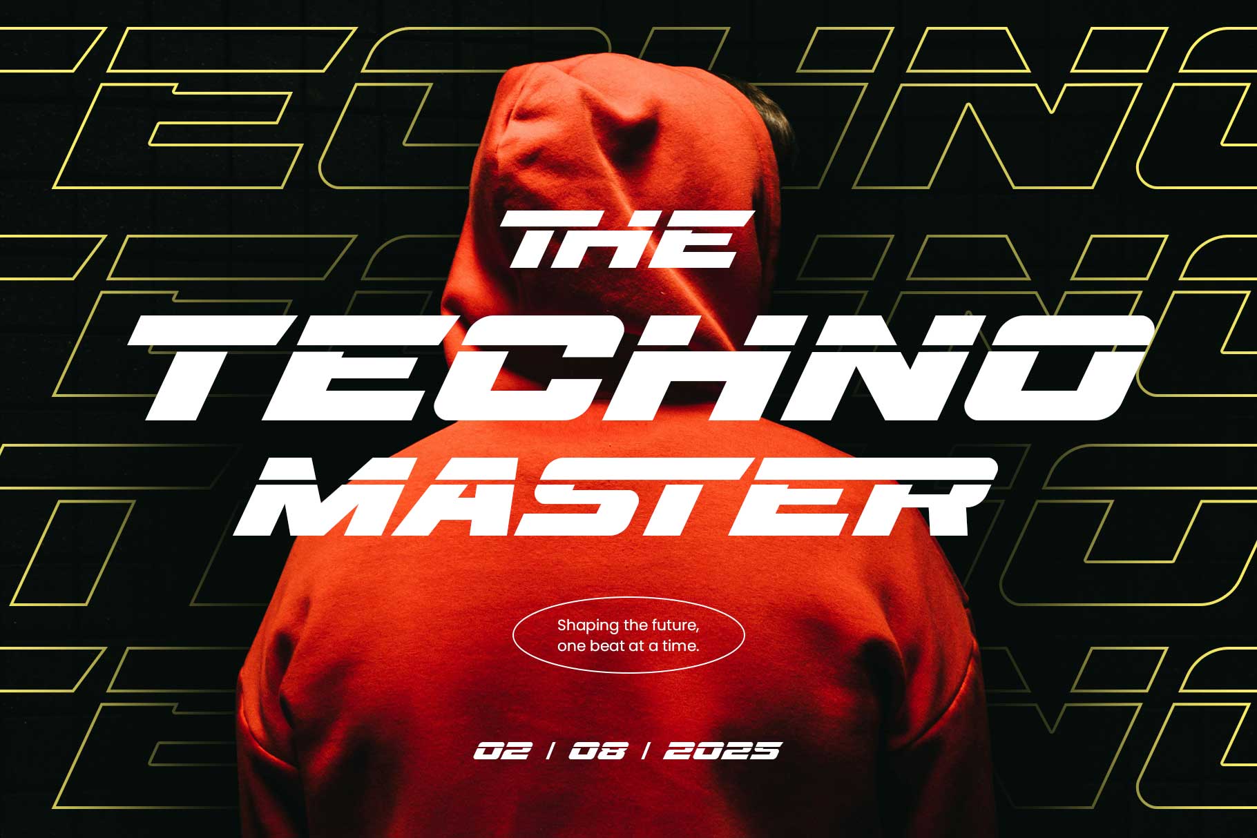
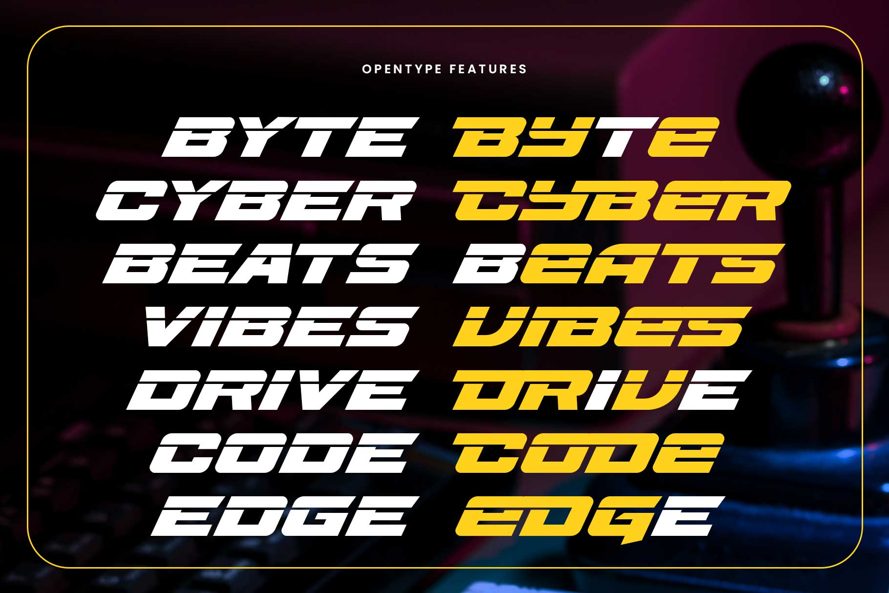
Sports are all about movement — and your typography should reflect that. Fonts with slants, sharp angles, and dynamic shapes help create a strong sense of speed and motion.
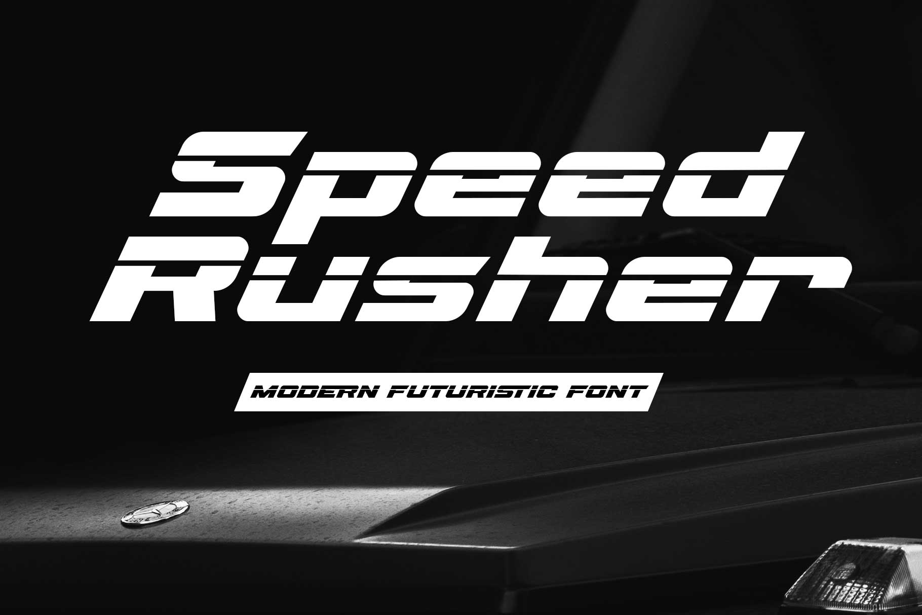
Speed Rusher Font
Speed Rusher is built to communicate velocity. Its forward-leaning structure makes it perfect for racing, running events, and high-speed sports branding. It visually pushes the eye forward, creating momentum.

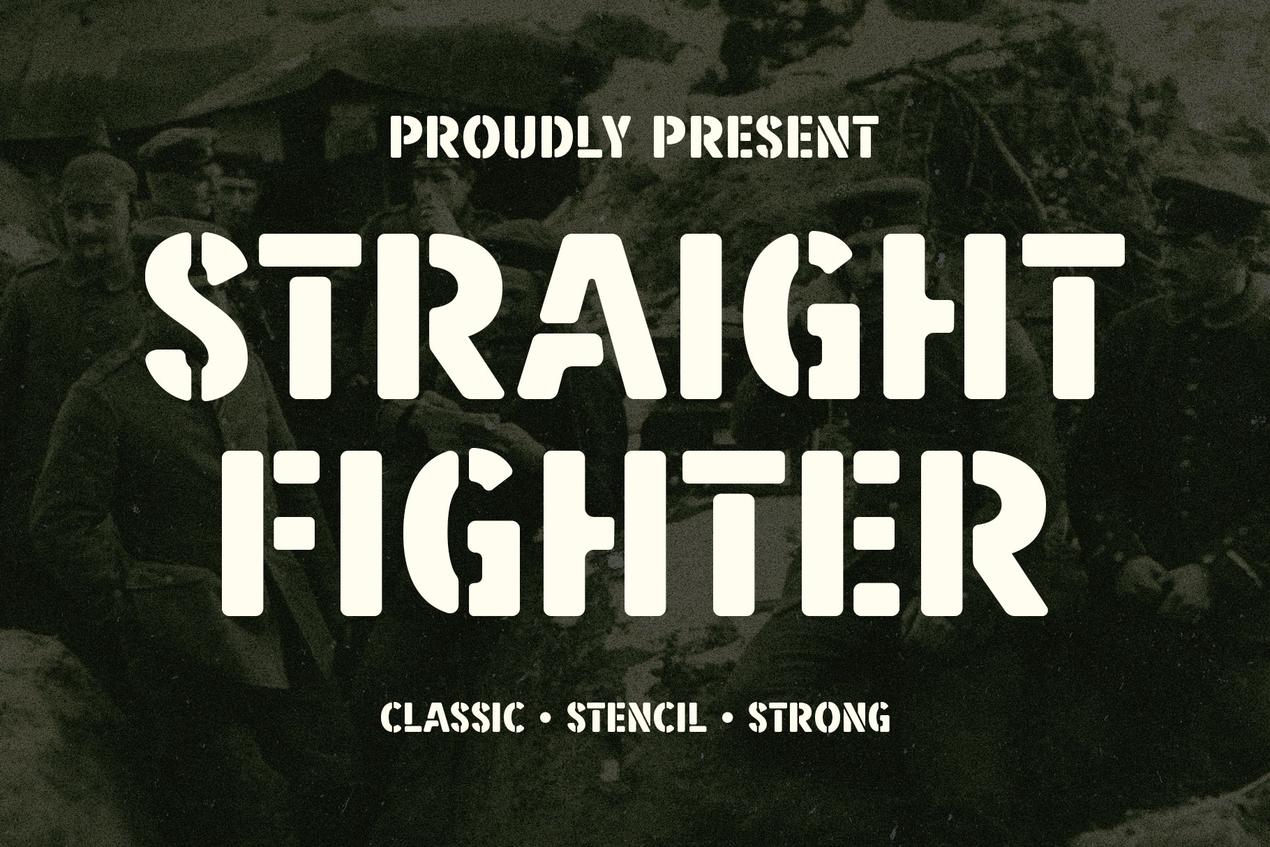
Straight Fighter Font
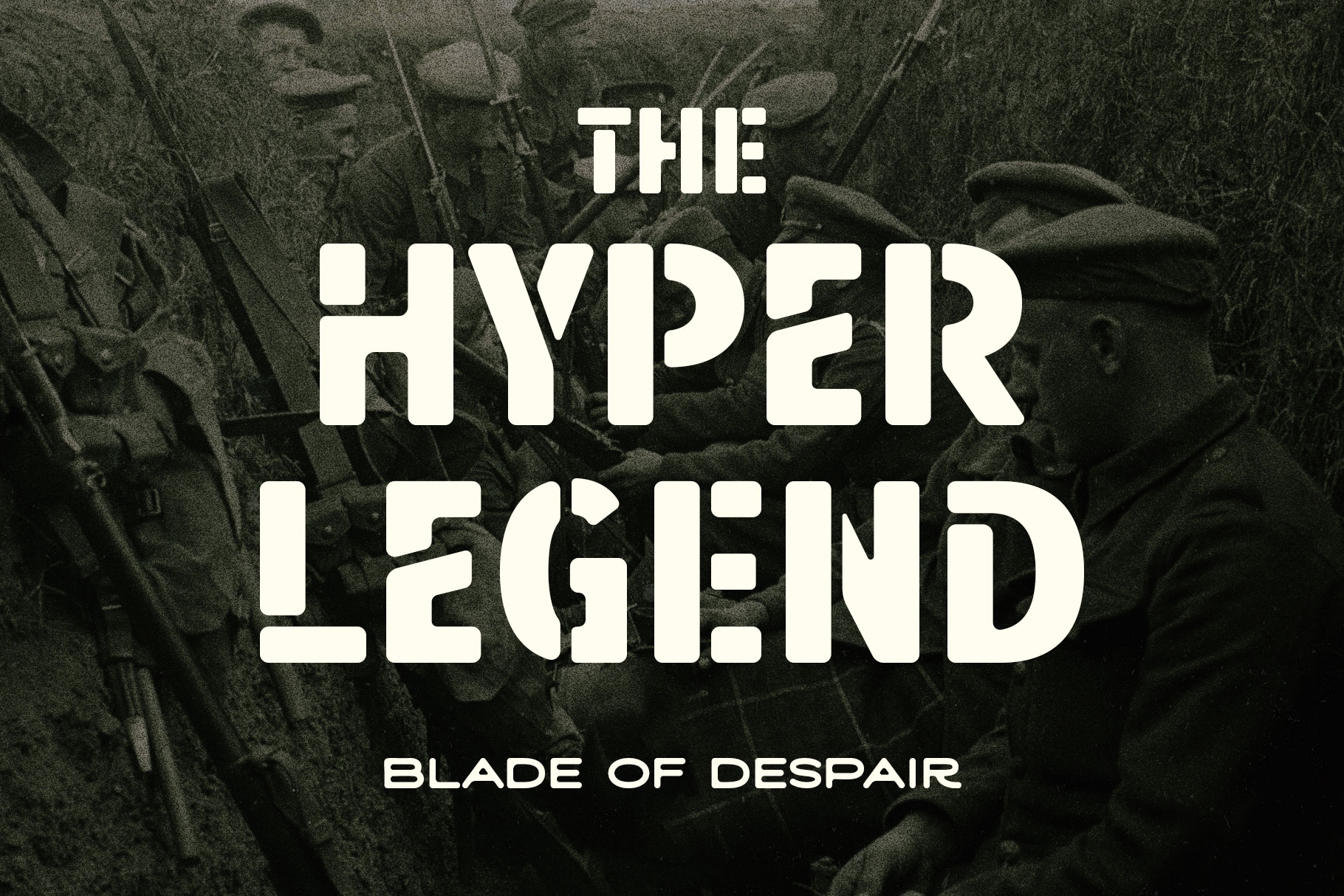
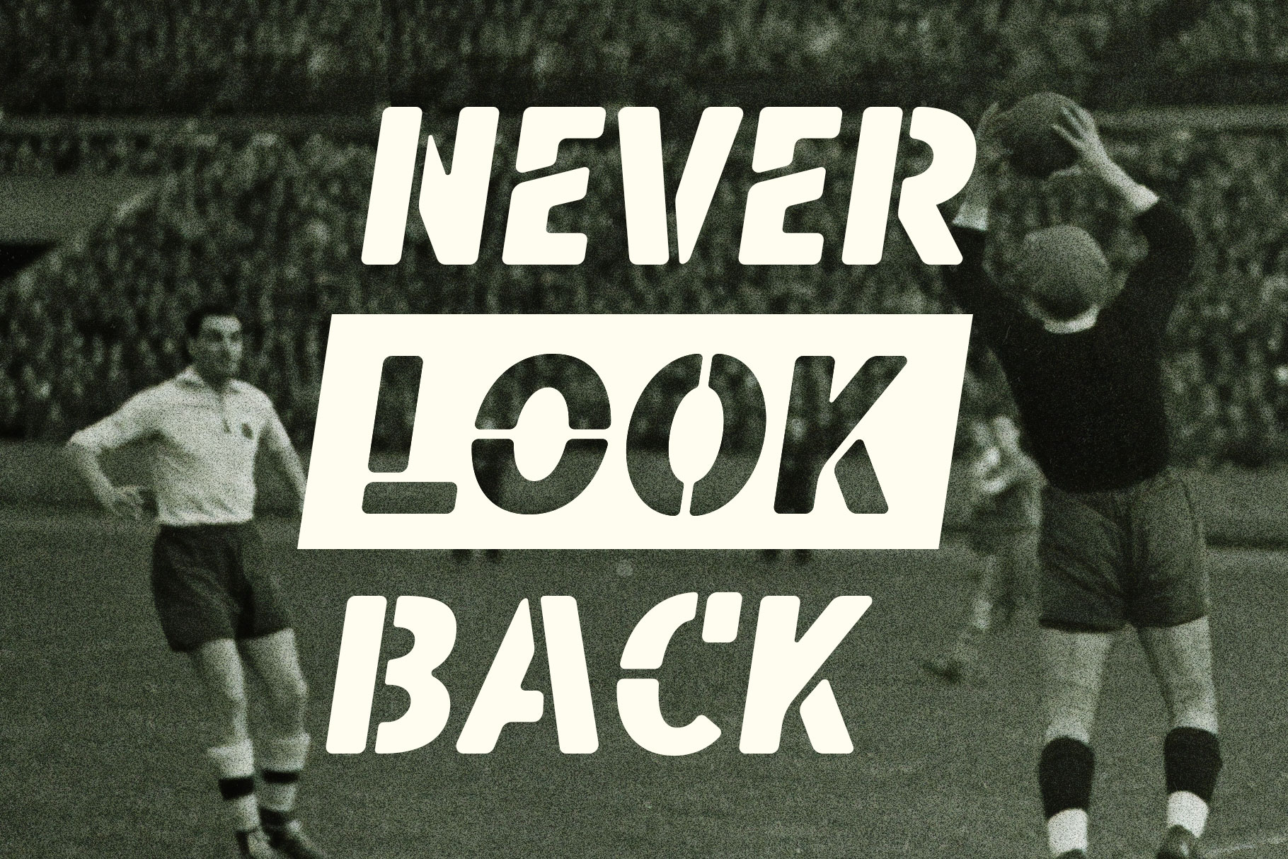
Straight Fighter is bold, direct, and impactful. It works best for combat sports, boxing brands, and strong identity systems where clarity and toughness are key.

Common Mistakes in Sports Typography
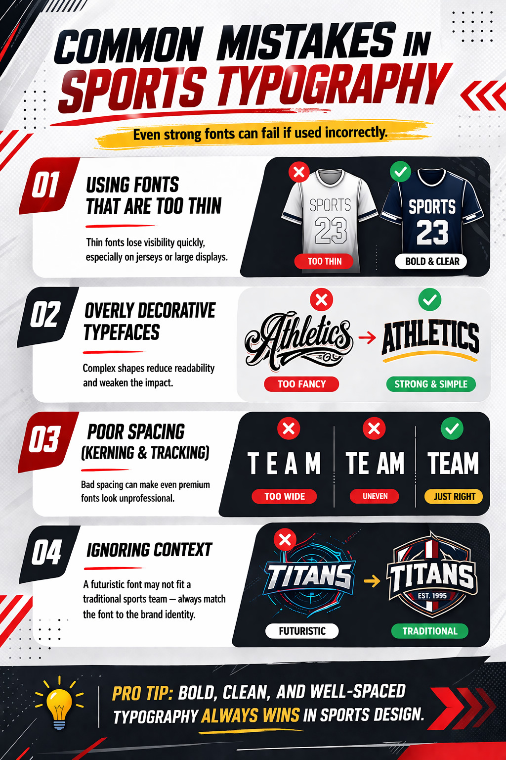
Even strong fonts can fail if used incorrectly. Here are some common mistakes to avoid:
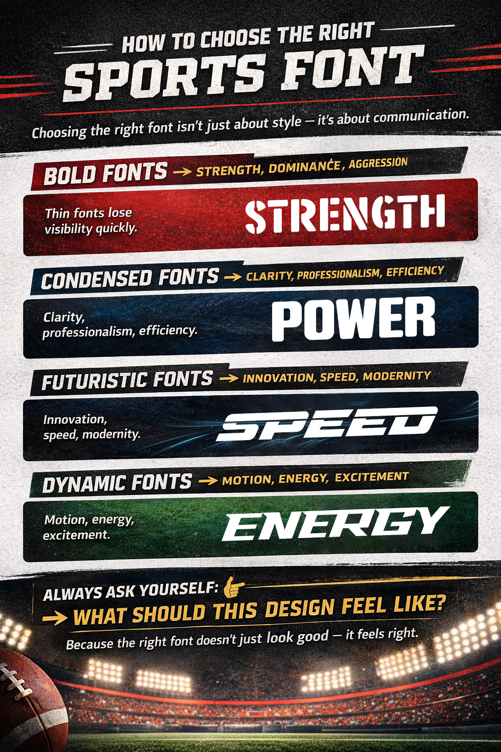
How to Choose the Right Sports Font
Choosing the right font isn’t just about style — it’s about communication.
Final Thoughts
Great sports design starts with strong typography. The fonts you choose will shape how your audience perceives your brand — whether it’s powerful, fast, modern, or premium. From bold display fonts to clean futuristic options, and jersey-ready choices, each typeface brings a unique personality to your design.
If you want your sports branding to stand out, don’t rely on generic fonts. Choose typefaces that are built for impact, designed for performance, and ready for competition.