Let’s be honest—sometimes a design just feels cheap.
You can’t always explain it right away, but you know it when you see it.
The layout looks messy, the colors feel off, and somehow… it just doesn’t look professional.
The frustrating part?
It’s often not about your tools, your creativity, or even your experience.
It’s about a few small mistakes that quietly ruin the overall look.
The good news: once you notice them, they’re surprisingly easy to fix.
1. You’re Using Too Many Fonts
One of the fastest ways to make a design look unprofessional is using too many fonts at once. Mixing different styles without a clear system creates visual chaos. Instead of looking creative, it feels inconsistent and confusing. How to Fix it:
Stick to 2-3 fonts maximum:
- One for headings
- One for body text
- One for variation/additional case (optional)
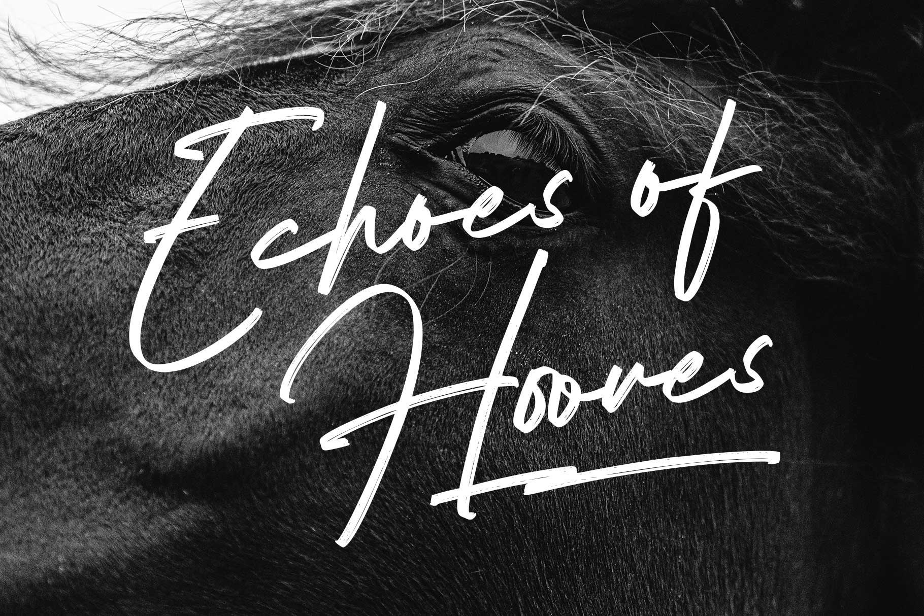
Font in used : Moldern
If you want variation, use weights (bold, regular, light) instead of adding new fonts. Clean typography instantly upgrades your design.
2. Poor Spacing (This Is the Silent Killer)
Bad spacing is one of the biggest reasons a design looks cheap—and most beginners don’t even realize it. Text too close together, elements crammed in corners, or inconsistent gaps can destroy readability and balance. How to Fix it:
- Give your design room to breathe
- Use consistent margins and padding
- Increase line height for better readability
Font in used : Broken Console
Think of spacing as a luxury.
The more intentional it is, the more premium your design feels.
3. Weak Font Choices
Not all fonts are created equal.
Some fonts instantly feel polished, while others feel generic or outdated. Using low-quality fonts can drag down your entire design—even if everything else is done right. How to Fix it:
- Avoid overused or poorly designed fonts
- Choose fonts with good spacing and clean curves
- Match the font style with your design goal

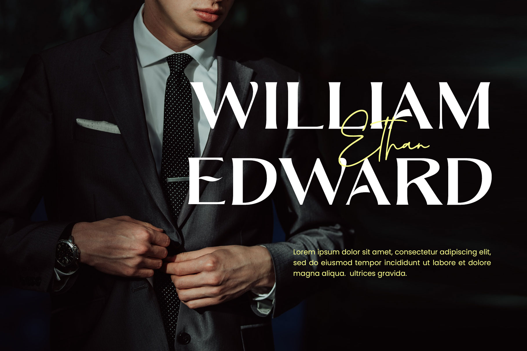
Font in used : Bronela
A strong font alone can elevate a basic layout into something that looks professionally crafted.
4. No Visual Hierarchy
If everything looks equally important, nothing stands out. A flat design with no hierarchy makes it hard for viewers to know where to look first. How to Fix it; Create clear contrast between elements:
- Use larger sizes for headlines
- Use bold weight for emphasis
- Use smaller text for secondary info

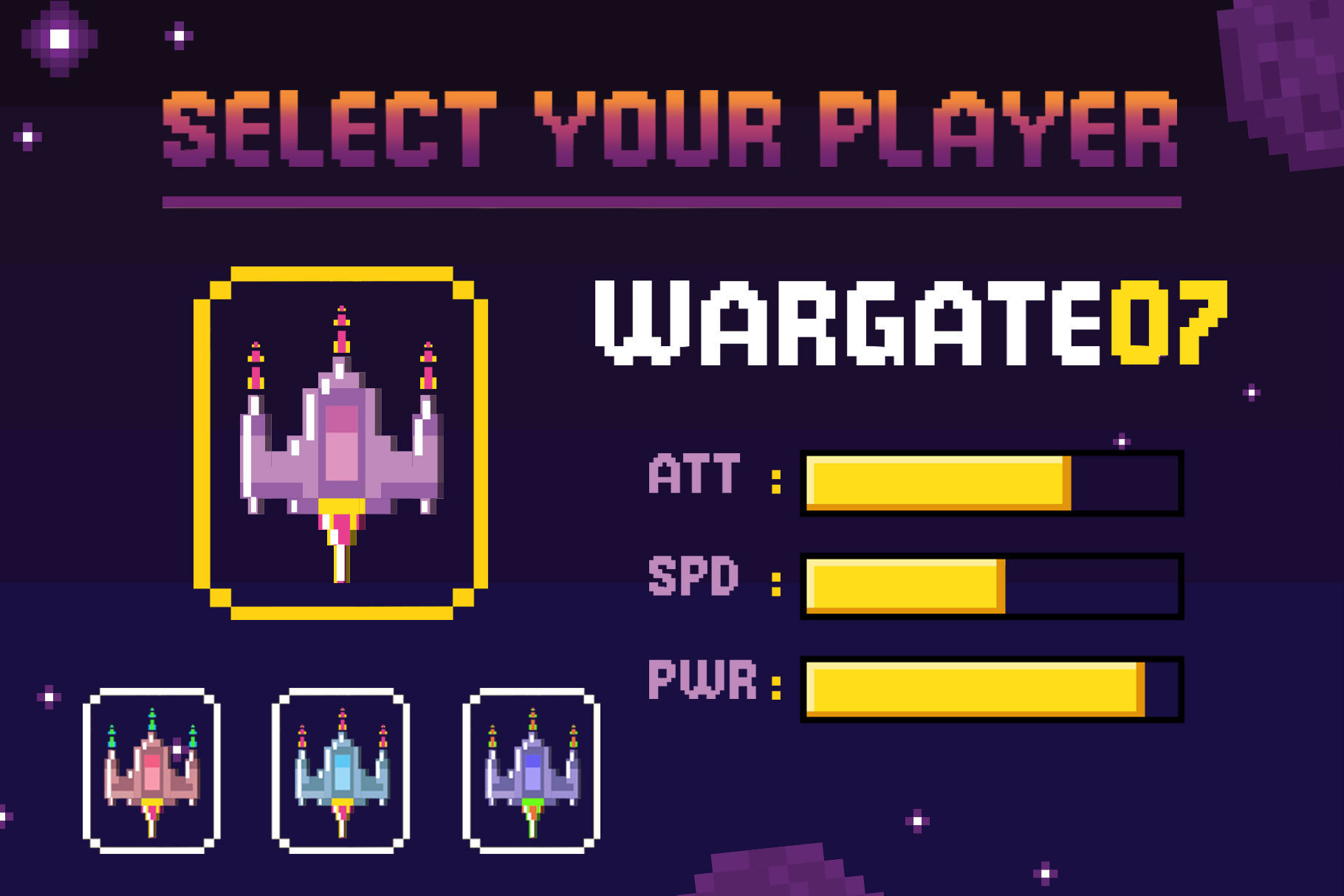
Font in used : Wonder Night
Guide the viewer’s eye.
Good design isn’t just about looks—it’s about direction.
5. Inconsistent Alignment
Misaligned elements are subtle, but they instantly make a design feel sloppy. Even a few pixels off can create a sense of imbalance. How to Fix it:
- Align everything to a grid
- Keep text consistently left, center, or right
- Avoid random placements

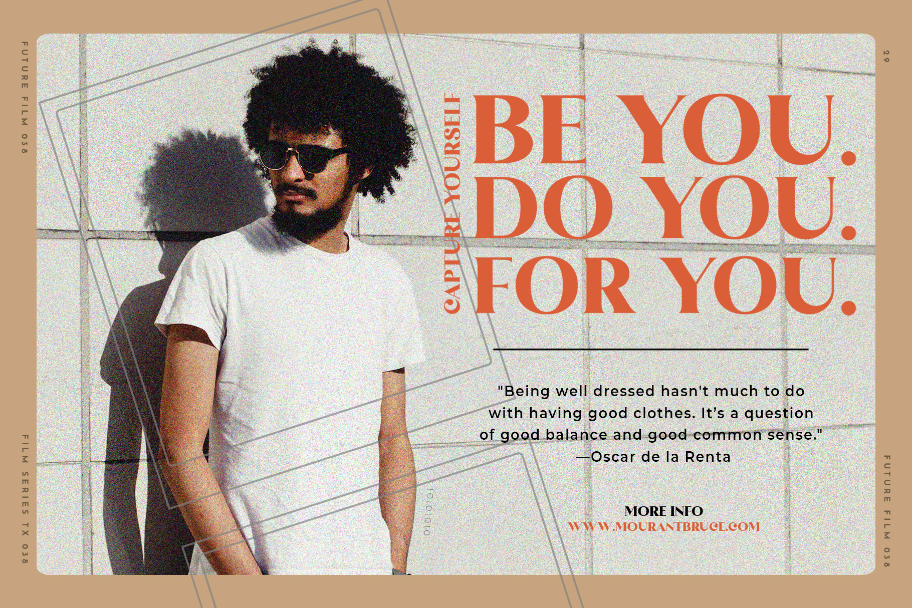
Font in used : Ranille
Alignment creates order. And the order feels professional.
6. Bad Color Combinations
Color can make or break your design. Too many colors, clashing tones, or poor contrast can make your work feel cheap and overwhelming. How to Fix it:
- Stick to 2–3 main colors
- Use contrast wisely
- Avoid overly saturated combinations

Font in used : Romelio Font Duo
If you’re unsure, start simple: Black, white, and one accent color is often enough.
7. Overdesigning (Trying Too Hard)
Ironically, trying to make your design “look cool” can ruin it. Too many effects, shadows, gradients, and decorative elements can make everything feel heavy and unrefined. How to Fix it:
- Remove unnecessary elements
- Keep only what adds value
- Focus on clarity over decoration

Font in used : Mortend
Simplicity isn’t boring—it’s powerful.
8. Ignoring Consistency
Consistency is what separates amateur work from professional design. When spacing, font sizes, or colors change randomly, your design loses structure. How to Fix it:
- Use a consistent style system
- Repeat patterns intentionally
- Keep typography and spacing uniform
Font in used : The Brande & Lotaline
Consistency builds trust—and trust makes your design feel high-quality.
9. Low-Quality Images or Assets
Blurry images, stretched graphics, or mismatched styles instantly downgrade your design. Even great layout won’t save poor visuals. How to Fix it:
- Use high-resolution images
- Maintain consistent style (photo vs illustration)
- Avoid distortion

Font in used : Black Ravens
Quality visuals = quality perception.
10. No Clear Purpose
A design without a clear goal often feels confusing.
Is it trying to sell? Inform? Entertain?
If the message isn’t clear, the design won’t feel strong. How to Fix it:
Before designing, ask:
- What is the goal?
- Who is this for?
- What should they notice first?

Font in used : Rambors
Clarity leads to better decisions—and better design.
Final Thoughts
If your design looks cheap, it’s not because you lack talent. It’s usually because of small details that are easy to overlook:
- Too many fonts
- Poor spacing
- Weak hierarchy
- Inconsistent alignment
Fix these, and your work can instantly look cleaner, more professional, and more valuable. Because great design isn’t about adding more— It’s about refining what’s already there.