If a picture is worth a thousand words, a font is worth the dozen feelings that arrive before the first sentence even finishes loading. Typography doesn’t sit politely in the background — it nudges, sighs, laughs, and sometimes flat-out sobs on behalf of your brand. In this piece, we’ll unbox how typefaces transmit emotion, why they can outmaneuver images in certain moments, and — crucially — how to use that power without turning your website into an emotional roller coaster (unless that’s your brand, in which case: more loops please).
Why can typography feel louder than image
Images are powerful storytellers — a sunset, a tear, a triumphant jump all hit fast and visceral. But images often tell what happened. Typography tells how to feel about it. The curve of a lowercase “g”, the gap between an “o” and an “n”, and the tension in a heavy condensed headline all act like body language for text. This nonverbal layer arrives faster than semantic processing: readers register tone before they read content. In many user journeys — headlines, CTAs, logos, packaging — tone is the main event, and type is the conductor.
Research from type-focused studies shows that type choice, spacing, and hierarchy significantly shape emotional perception and reading efficiency. Designers and neuroscientists have observed that different type styles evoke consistent emotional responses across many contexts, which is why a serious legal site uses restrained serifs while a playful kids’ brand picks rounded, bubbly letters.
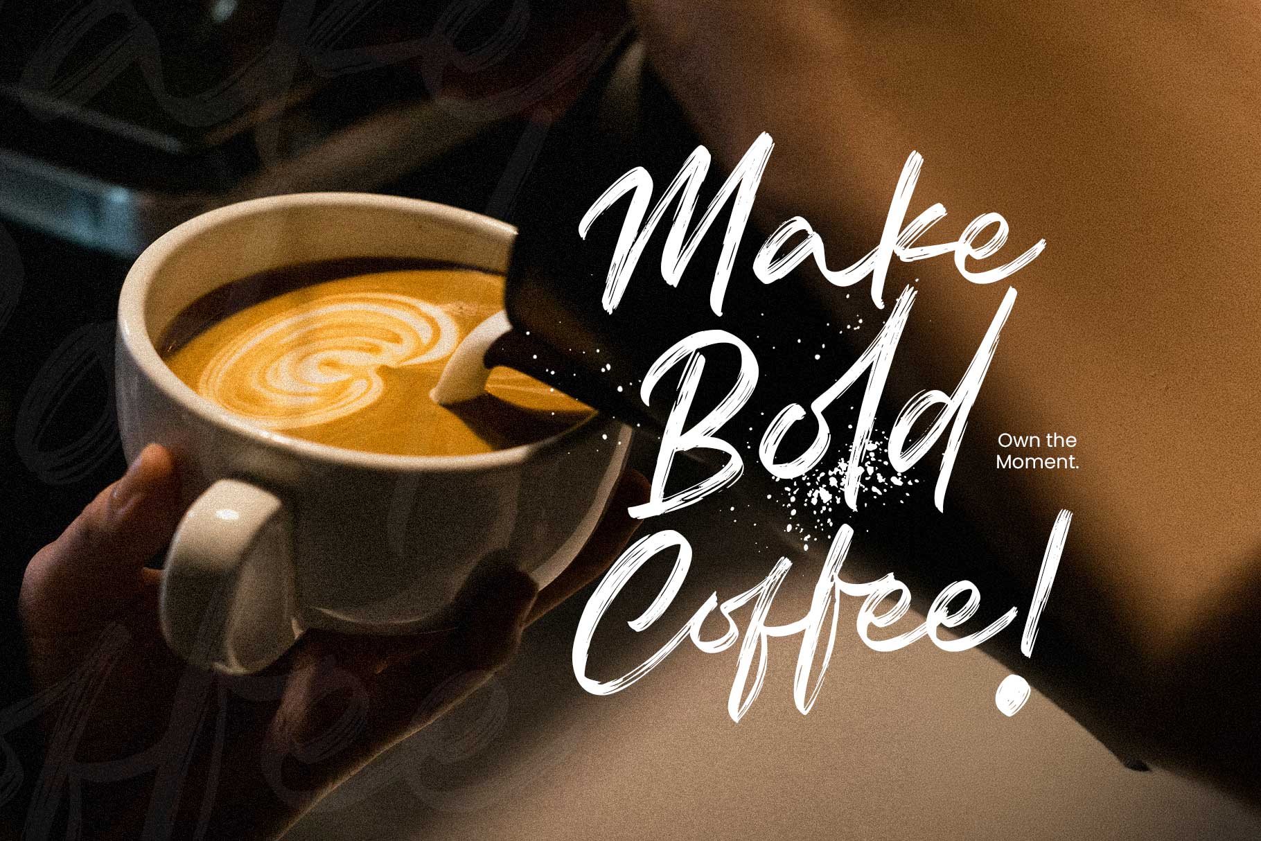
Font embrace the emotion. Font : Relsika
The mechanics of typographic emotion
How does a glyph generate a feeling? Here are the basic levers:
- Form & weight. Thick strokes communicate strength and urgency; thin strokes can feel delicate or elegant.
- Contrast. High contrast (thick vs thin strokes) often reads as refined or dramatic; low contrast tends toward neutrality and modernism.
- Terminal shape & curvature. Round terminals and soft bowls read friendly; sharp terminals feel clinical or edgy.
- Proportions. Tall x-heights (large lowercase body) read approachable and contemporary; narrow condensed forms read energetic or compact.
- Spacing / rhythm. Tight kerning can feel intense or intimate; loose spacing breathes calm.
- Style cues (serif vs sans vs script). Serifs often connote tradition and trust; humanist sans can feel warm; geometric sans can feel modern and detached; scripts read personal or emotional.
These elements interact like musical notes. A rounded, heavy typeface with generous spacing sings “warm hug,” while a high-contrast condensed serif with tight spacing whispers “authority with a side of drama.”
Typographic emotion mechanism. Font : Brozeri
Case studies: when type wins over picture
- The headline moment. On a homepage hero, an emotional headline set in an expressive serif can prime readers more reliably than a background image. The image sets scene; the type assigns mood. Leading design outlets are even predicting a resurgence of expressive, character-rich typography as a core trend for 2026 — a reaction against overly neutral, AI-generated visuals. Designers are leaning into “deliberate friction” and tactile type to restore human warmth.
- Brand trust without faces. Some fintech and healthcare brands omit people from hero imagery to avoid cliché and instead rely on carefully chosen serifs or humanist sans to signal credibility. The font here functions as a character actor: it plays dependable, empathetic, or innovative depending on subtle features.
- Micro-moments and CTAs. A button label in a warm, rounded sans can increase click comfort. That micro-emotional nudge sometimes outperforms a perfectly composed product shot because it directly addresses the decision point.
- Multilingual emotional fidelity. Cross-cultural research shows emotional responses to typographic styles can vary by region, but consistent typographic hierarchy and carefully chosen global-friendly families help preserve intent across locales. Companies are now pairing typographic systems with localization strategies to keep tone intact.
Scientific backing — not just designer folklore
This isn’t mystical thinking. Human–computer interaction researchers and typographers have shown that letterforms can be generated or modified to reflect emotional cues. One experimental system translated music’s emotional profile into calligraphic letterforms and produced typography that participants reliably associated with different emotional levels. That indicates an objective bridge between visual form and felt emotion.
Studies at design and perception labs also reinforce that we don’t just “like” fonts aesthetically; we use them as cognitive shortcuts for trust, urgency, warmth, or authority. When used deliberately, typography reduces noise and speeds emotional alignment with content.
When images still have the upper hand
Don’t get me wrong: fonts don’t replace images. Photos convey complex scenes, gestures, and human expressions in ways type can’t. Use images for specific human detail (faces, textures, environments). Use type for tone-setting, voice, and rhythm. The best UX and visual systems marry both: images answer “what,” typography answers “how.”
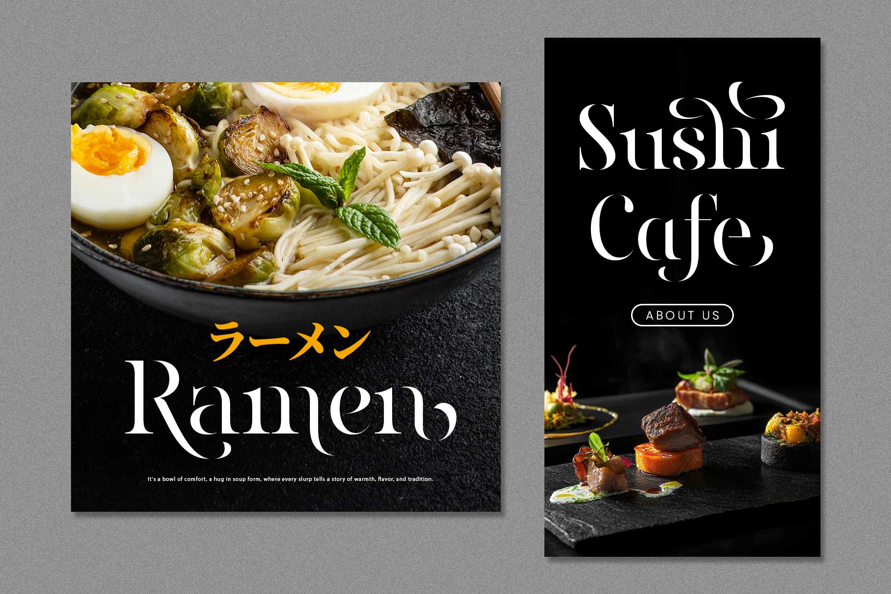
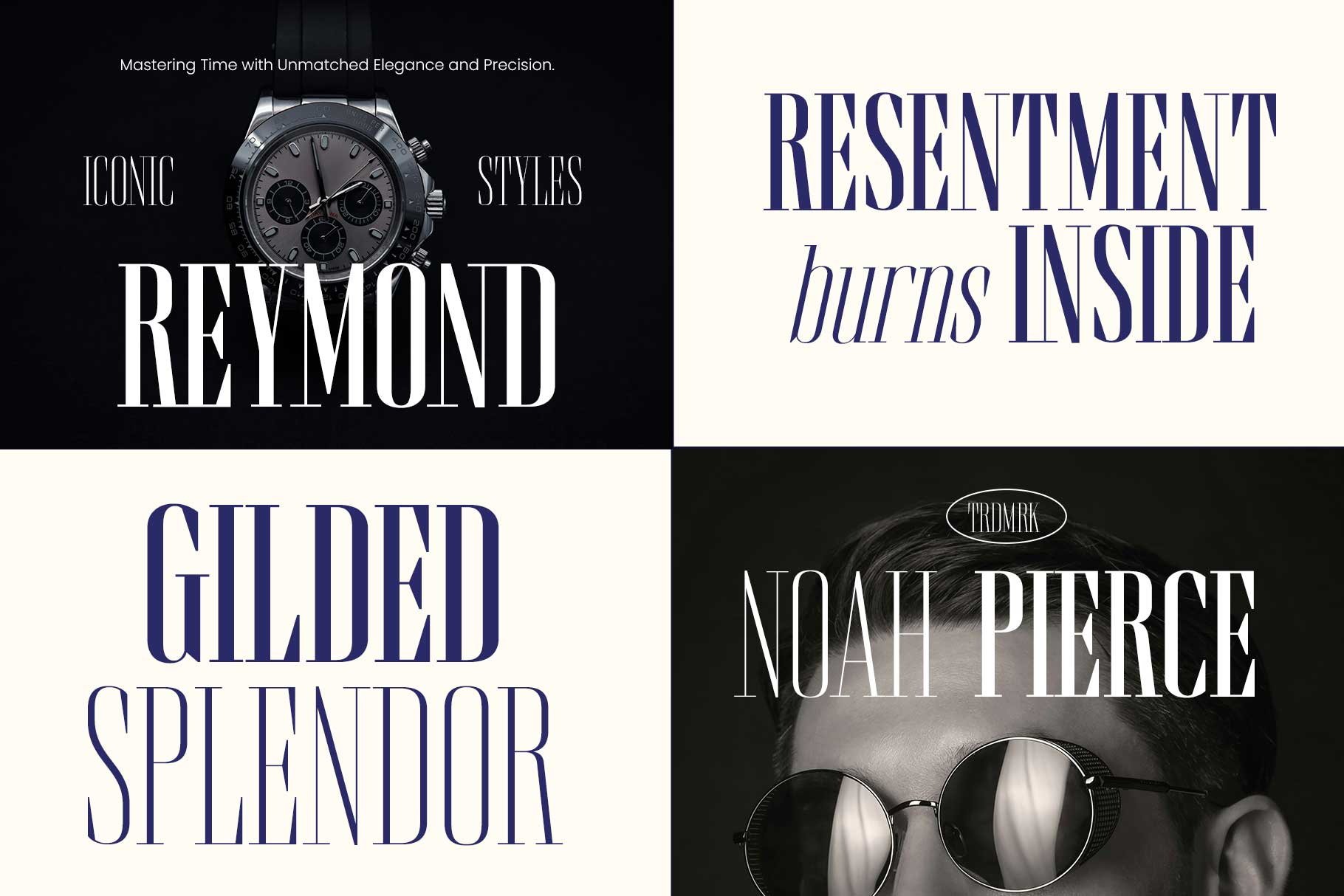
Image will always be the victory. Font : Ronaile
Practical guide: make your type cry (in a good way)
Want your typography to carry emotional weight without melodrama? Try this checklist:
- Start with tone words. Pick three adjectives (e.g., “reassuring, modern, witty”) and judge candidate families against them.
- Test in context. Don’t evaluate a font in a specimen sheet—test it in headlines, microcopy, and buttons.
- Hierarchy is emotional architecture. The relative scale, weight, and spacing determine which words lead emotionally.
- Pair with intent. Limit pairs to 2–3 families. Balance a characterful display face with a neutral reading face.
- Motion and interaction. Kinetic typography (subtle motion) elevates emotional nuance on digital platforms. Use sparingly for emphasis.
- Accessibility first. Emotional type fails if users can’t read it. Contrast and legibility are non-negotiable.
- Localize typographic intent. If you’re global, check how tone registers in target languages; tweak families and spacing per locale.
Quick examples you can try right now
- Want warmth? Try a humanist sans paired with a friendly rounded display for headlines.
- Want authority? Use a restrained serif with moderate contrast and narrow counters.
- Want playful mischief? Use an irregular display face (with careful spacing) and pair with a geometric sans for body copy.

But image and typography can always be the great combination. Font : Blackson
Final note: ethical emotional design
If typography can nudge feelings, it can also mislead. Use emotional typography honestly: don’t use a warm, humanist face to mask predatory UX or confusing policy. Emotional clarity is trust currency.