Typography is often the first thing people notice about a brand. Before customers read your slogan, explore your website, or purchase your products, they subconsciously judge your brand through its visual identity. One of the biggest contributors to that identity is your font combination.
A carefully selected font combination can communicate professionalism, luxury, creativity, confidence, or friendliness within seconds. On the other hand, poorly matched fonts can make even the best-designed brand feel inconsistent and unpolished.
While designers have traditionally spent hours experimenting with different font pairings, professionally designed font duos have become an increasingly popular solution. Instead of combining unrelated typefaces and hoping they work together, font duos are intentionally designed to complement each other from the beginning.
Whether you’re creating a logo, website, product packaging, social media graphics, or editorial layouts, a well-crafted font duo helps establish consistency while saving valuable design time.
In this guide, we’ll explore why font duos have become one of the smartest typography choices for modern branding and how the right font combination can strengthen your visual identity.
What Is a Font Duo?
A font duo is a collection of two complementary typefaces designed to be used together.
Unlike manually pairing fonts from different designers or font families, a font duo already shares compatible proportions, spacing, rhythm, and overall personality.
Some of the most common font combinations include:
• Serif + Script
• Sans Serif + Script
• Serif + Sans Serif
• Display + Sans Serif
• Decorative + Minimal Sans
Because these fonts are designed with harmony in mind, they naturally create balanced layouts without requiring extensive experimentation.

________________________________________
Why Font Combination Matters
Every successful brand tells a story.
Typography is one of the strongest visual tools available for communicating that story before customers read a single word.
An effective font combination creates:
• Clear visual hierarchy
• Better readability
• Stronger brand recognition
• Consistent visual identity
• More memorable customer experiences
Imagine a luxury skincare brand using playful comic lettering, or a technology startup relying entirely on medieval calligraphy. Even if the products are excellent, the typography sends conflicting messages.
That’s why selecting the right font combination is just as important as choosing the right color palette or logo.
________________________________________
The Problem With Pairing Fonts Yourself
There are thousands of professional fonts available today.
Unfortunately, having more choices doesn’t always make the process easier.
Many designers struggle with:
• Matching proportions
• Similar font weights
• Conflicting personalities
• Uneven spacing
• Poor hierarchy
• Inconsistent readability

Font in used Olivia Jenisen Font Duo
It’s common to spend hours testing multiple font combinations before finally finding one that feels balanced.
Professionally designed font duos eliminate much of this guesswork by offering typefaces that were created to work together from day one.
“A font duo designed to work together, making it easy to create balanced typography without sacrificing hierarchy, layout, or aesthetics.”
________________________________________
Why Font Duos Save Designers Time
Modern branding projects rarely involve just one deliverable.
A single brand identity often includes:
• Logos
• Packaging
• Websites
• Business cards
• Social media templates
• Advertisements
• Product labels
• Presentations
Instead of searching endlessly for compatible fonts, designers can immediately begin working with a cohesive typography system.
This allows more time to focus on layout, imagery, color, and overall brand strategy.
________________________________________
Better Consistency Across Every Platform
One of the greatest advantages of a font duo is consistency.
Customers interact with brands across multiple channels every day. Your website, Instagram posts, advertisements, packaging, and printed materials should all feel connected.
Using a professionally designed font combination ensures the same visual language appears across every touchpoint.
That consistency helps build familiarity, trust, and long-term brand recognition.
________________________________________
Popular Font Combination Styles
Serif + Italic
One of the most timeless font combinations pairs an elegant serif with a handwritten script.
The serif provides structure, authority, and readability, while the script introduces warmth and personality.
This combination has become a favorite for luxury brands, wedding businesses, beauty products, cafés, photographers, and premium packaging.
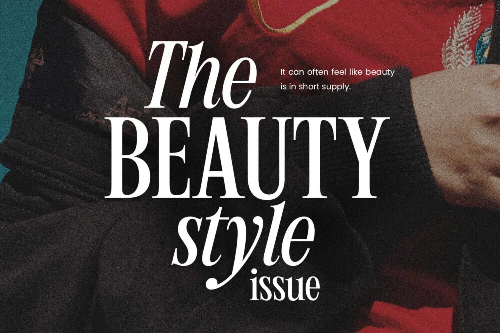
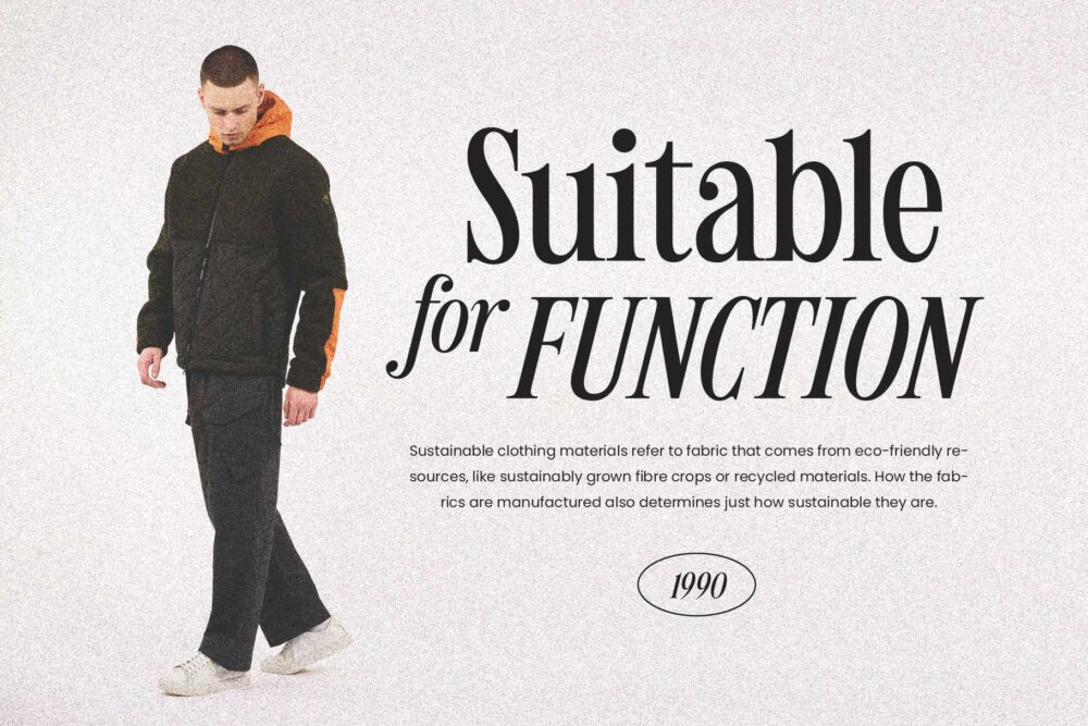
A great example is Humble Nostalgia, which combines an elegant serif with expressive handwritten elements to create typography that feels sophisticated without becoming overly formal.
________________________________________
Elegant Serif + Modern Script
Luxury branding often relies on typography that feels refined while maintaining a personal touch.
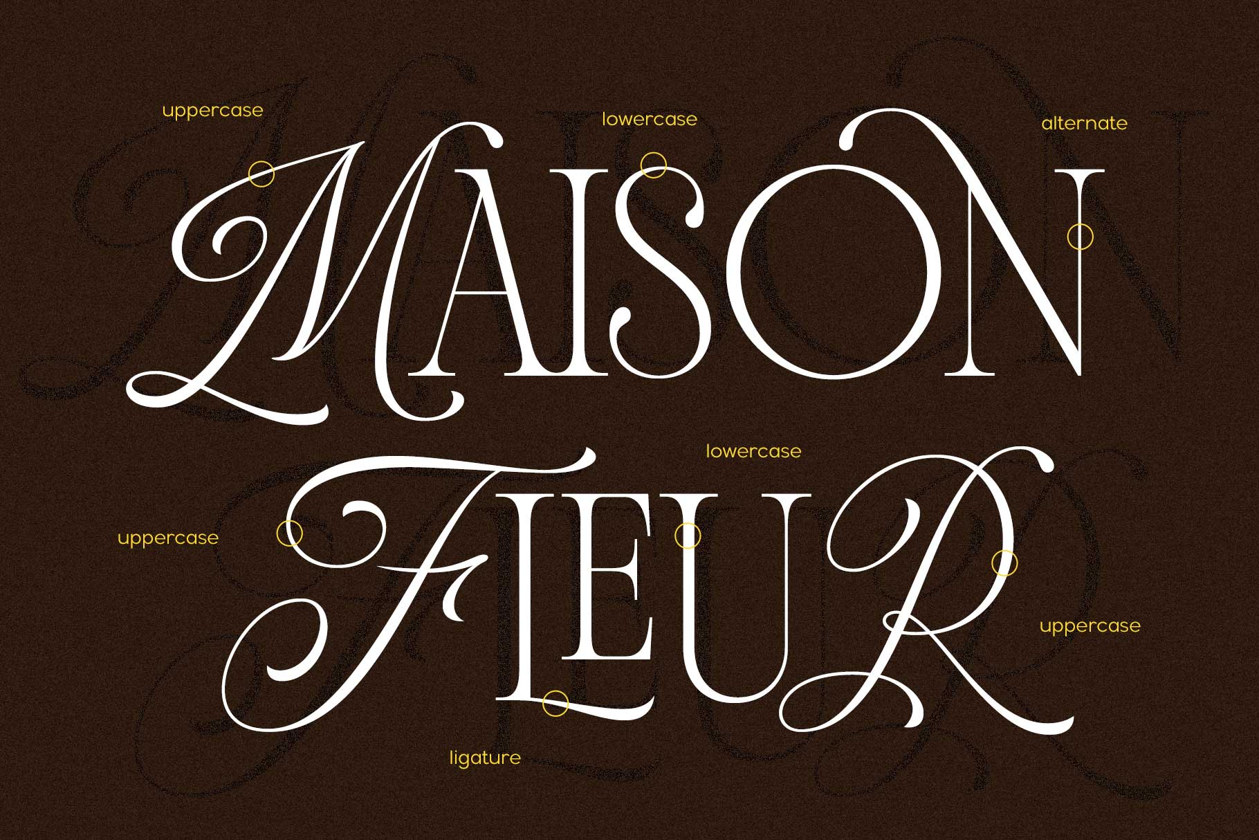
Brecia Lovely pairs graceful serif letterforms with a stylish script, creating a font duo suitable for logos, invitations, fashion branding, packaging, and social media content.
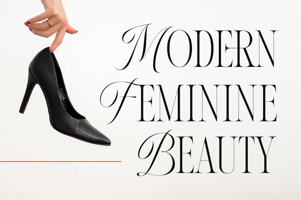
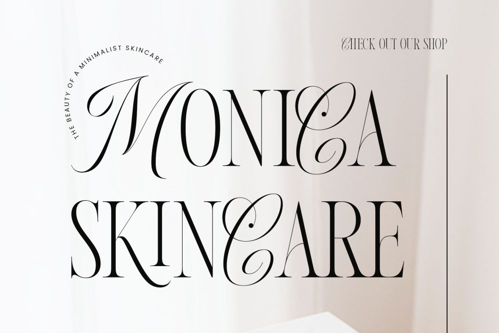
The contrast between structured typography and flowing handwriting creates a memorable visual identity that works across both digital and print media.
________________________________________
Hybrid Blackletter + Sans Serif
Many people associate blackletter fonts exclusively with medieval manuscripts, gothic aesthetics, tattoo culture, or heavy metal artwork. While those styles remain closely connected to blackletter typography, modern branding has shown that blackletter can also become part of a sophisticated and highly effective font combination.
The secret lies in contrast.
Instead of pairing blackletter with another decorative font, combining it with a clean sans serif creates balance. The blackletter becomes the expressive centerpiece, while the sans serif adds clarity, readability, and a contemporary touch. Rather than feeling outdated, the combination creates a bold identity that stands out in today’s competitive design landscape.
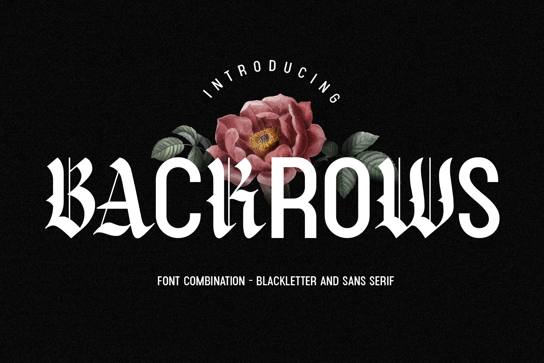
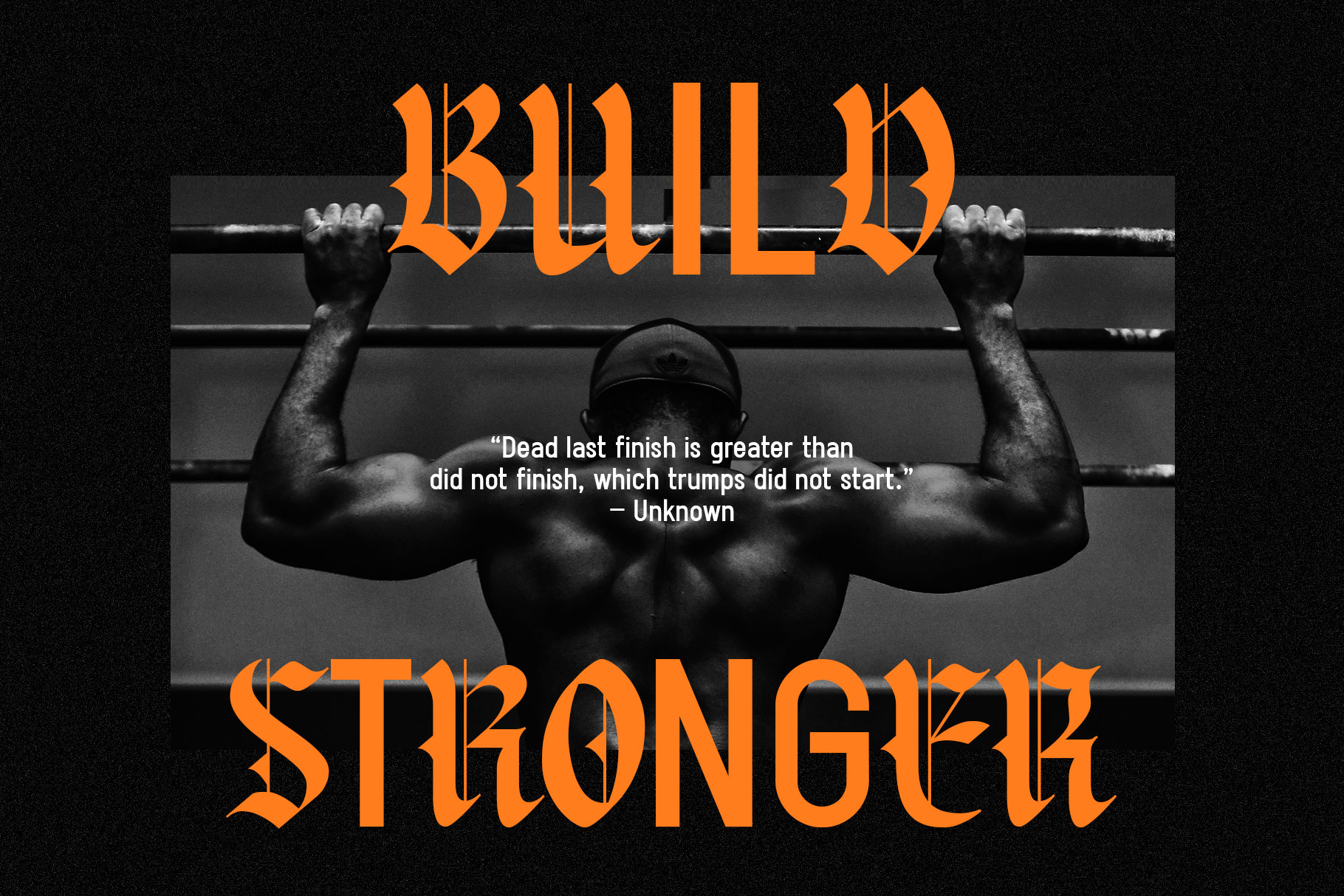
A perfect example is Backrows Font Combination, which pairs an expressive blackletter with a modern sans serif. This carefully crafted duo demonstrates that even traditional lettering styles can feel fresh when matched with the right companion font. The result works beautifully for streetwear brands, apparel labels, music artwork, creative agencies, editorial headlines, cafés, premium packaging, and businesses looking to establish a memorable personality.
It serves as a reminder that successful font combinations aren’t about following rules—they’re about creating harmony through contrast.
________________________________________
Versatile Font Duos for Different Brand Personalities
Every business has its own voice, and typography should reflect that personality.
Some brands aim for elegance, while others embrace creativity, minimalism, or a handcrafted aesthetic. Choosing a professionally designed font duo makes it easier to find a typography system that naturally aligns with your brand.
Several excellent examples include:
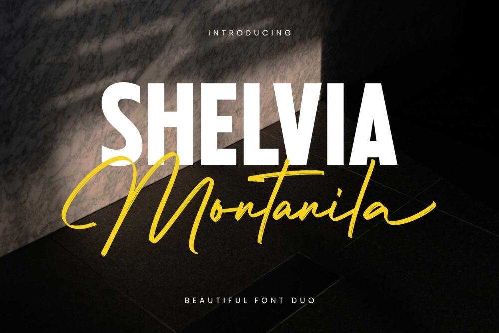
Shelvia Montanila
A sophisticated font duo that combines modern elegance with handwritten charm, making it ideal for beauty brands, boutiques, wedding projects, and premium branding.
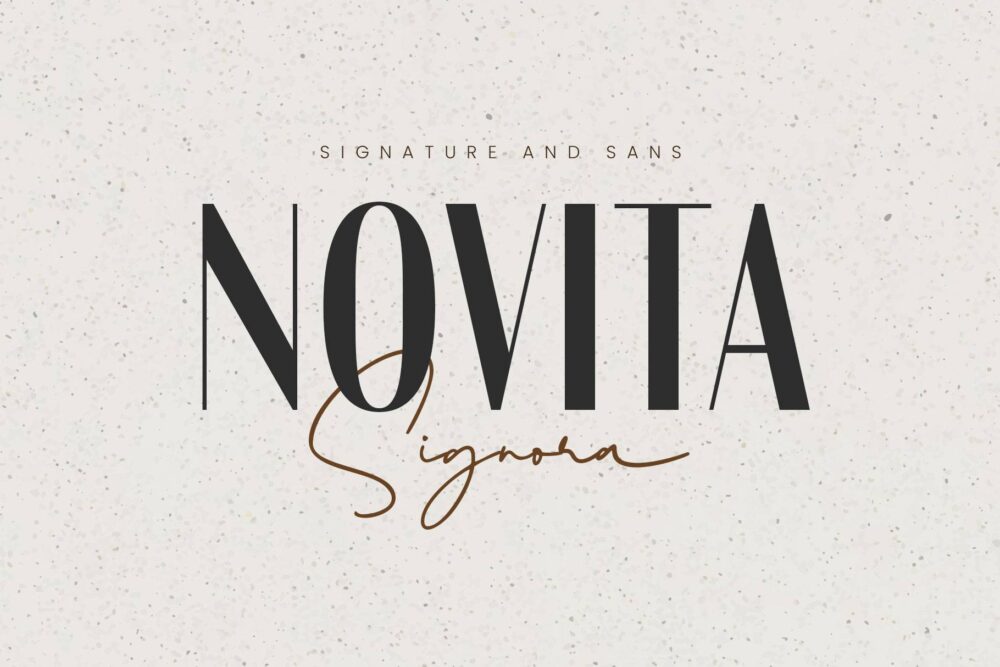
Novita Signora
Perfect for businesses seeking a refined and feminine visual identity, offering excellent flexibility for logos, social media, and editorial designs.
Wonderful Melanesia
A creative font duo that delivers warmth, personality, and handcrafted appeal, making it suitable for lifestyle brands, cafés, and creative businesses.

Niquitta Mirzani
Designed for modern branding projects that require elegance with a contemporary twist, suitable for luxury packaging, personal branding, and fashion industries.

Each font duo offers a unique visual personality while maintaining the harmony necessary for professional branding.
________________________________________
Common Font Combination Mistakes
Even excellent fonts can produce poor results if they’re combined incorrectly.
Here are some common mistakes to avoid.
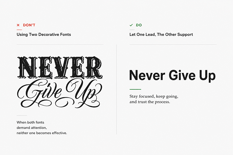
- Using Two Decorative Fonts
When both fonts demand attention, neither one becomes effective.
Instead, allow one font to lead while the other supports it.
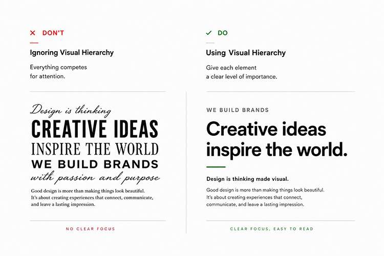
- Ignoring Visual Hierarchy
Headlines, subheadings, and body text should each have a clear purpose.
Typography works best when readers naturally know where to look first.
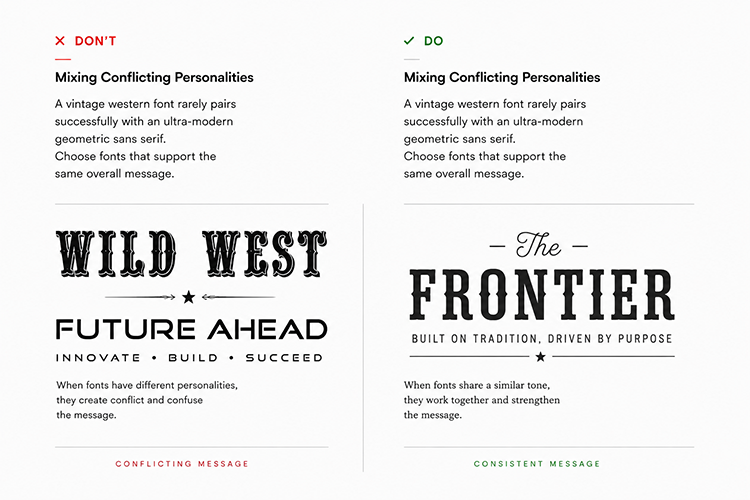
- Mixing Conflicting Personalities
A vintage western font rarely pairs successfully with an ultra-modern geometric sans serif.
Choose fonts that support the same overall message.
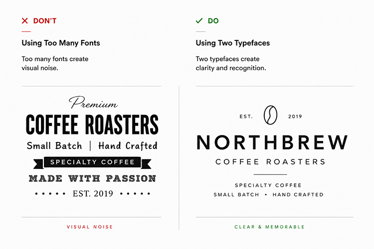
- Using Too Many Fonts
Many of the world’s strongest brands use only two typefaces throughout their entire identity.
Keeping your font combination simple often creates stronger recognition.
_____________________________________
Choosing the Right Font Combinations
Before selecting typography for your next branding project, consider these questions:
• Does it match the brand personality?
• Is the hierarchy easy to understand?
• Does it provide enough contrast?
• Is it readable on both print and digital media?
• Will it remain timeless over the next several years?
A professionally designed font duo answers many of these questions automatically, giving designers greater confidence and efficiency throughout the creative process.
________________________________________
Final Thoughts
Choosing the right font combination is about more than making your designs look attractive. It’s about creating a visual system that communicates your brand’s personality, improves readability, and remains consistent across every touchpoint.
Whether you prefer a classic serif and script pairing, a modern hybrid font, or even a bold blackletter combined with a clean sans serif, the key is finding balance. A successful font combination creates contrast without conflict, helping each typeface support the other instead of competing for attention.
Rather than relying on trial and error, many designers choose professionally crafted font duos because they offer built-in harmony and save valuable time during the creative process. This allows designers to focus less on pairing fonts and more on building memorable brand experiences.
Ultimately, great typography isn’t about following trends—it’s about choosing typefaces that communicate clearly, reflect your brand’s identity, and remain effective for years to come. A thoughtful font combination is one of the simplest yet most impactful ways to create branding that people recognize, trust, and remember.