Some fonts age better than others because they prioritize readability, balanced proportions, adaptability, and timeless design principles over temporary trends. Typefaces such as Helvetica, Garamond, and Futura remain popular because they continue to perform effectively across different mediums and design eras.
Why Some Fonts Age Better Than Others
Every year, thousands of new fonts enter the market.
Some gain attention almost immediately. They appear in branding projects, social media graphics, packaging designs, and websites everywhere. For a brief moment, they feel fresh, exciting, and impossible to avoid.
Then, a few years later, they seem to vanish.
Meanwhile, certain typefaces continue to thrive decade after decade. Designers keep returning to them. Brands continue to trust them. Publishers, institutions, and creative professionals rely on them long after countless alternatives have appeared.
This raises an interesting question:
Why do some fonts age better than others?
The answer isn’t simply that older fonts are better designed. Nor is it because famous typefaces benefit from nostalgia.
In reality, timeless typography is usually the result of specific design principles that allow a typeface to remain useful regardless of changing trends, technologies, and cultural preferences.
Let’s explore what separates a timeless typeface from one that becomes trapped in its era.
Timeless Fonts Prioritize Function Over Fashion
One of the most common reasons fonts age poorly is that they are designed around trends rather than utility.
Design trends are constantly evolving. What feels innovative today may feel outdated tomorrow.
Throughout design history, we’ve seen waves of typography inspired by specific cultural moments:
- Psychedelic lettering in the 1960s
- Disco-inspired typography in the 1970s
- Grunge aesthetics in the 1990s
- Futuristic techno fonts in the early 2000s
- Hyper-minimal geometric branding in the 2010s
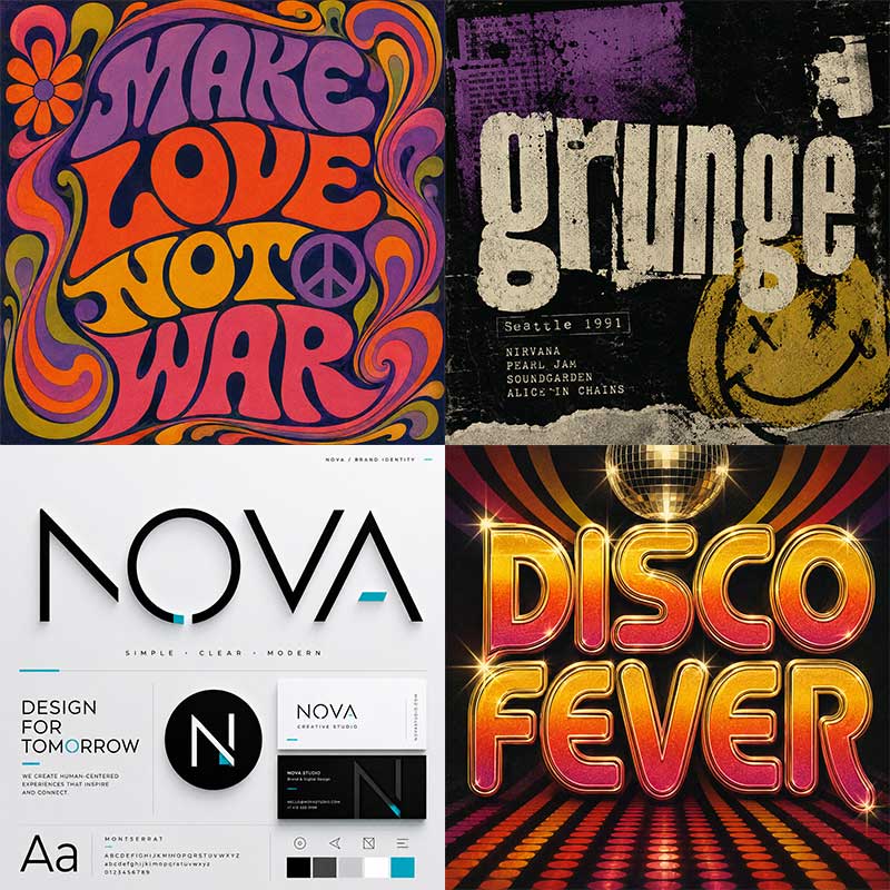
There’s nothing inherently wrong with trend-driven typography. In fact, trend-focused typefaces often capture the spirit of their time beautifully. The challenge is that trends have expiration dates. Fonts that survive for decades tend to focus on solving communication problems rather than chasing visual fashion.
Case Study: Helvetica
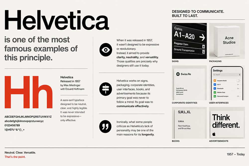
Helvetica is one of the most famous examples of this principle.
When it was released in 1957, it wasn’t designed to be expressive or revolutionary. Instead, it aimed to provide clarity, neutrality, and versatility. Those qualities are precisely why designers still use it today.
Helvetica works on signs, packaging, corporate identities, user interfaces, books, and advertisements because its primary goal was never to follow a trend. Its goal was to communicate effectively.
Ironically, what some people criticize as Helvetica’s lack of personality may be one of the main reasons for its longevity.
Font Helvetica
Strong Fundamentals Outlast Trends
Design styles change.
Human perception changes much more slowly.
People have always responded positively to visual balance, consistency, and readability. As a result, fonts built on strong fundamentals tend to remain relevant longer than those built on stylistic novelty.
A typeface with balanced proportions, comfortable spacing, and clear letterforms continues to perform well regardless of contemporary design preferences.
This principle applies to architecture, industrial design, and typography alike.
Font Brozeri
Case Study: Garamond
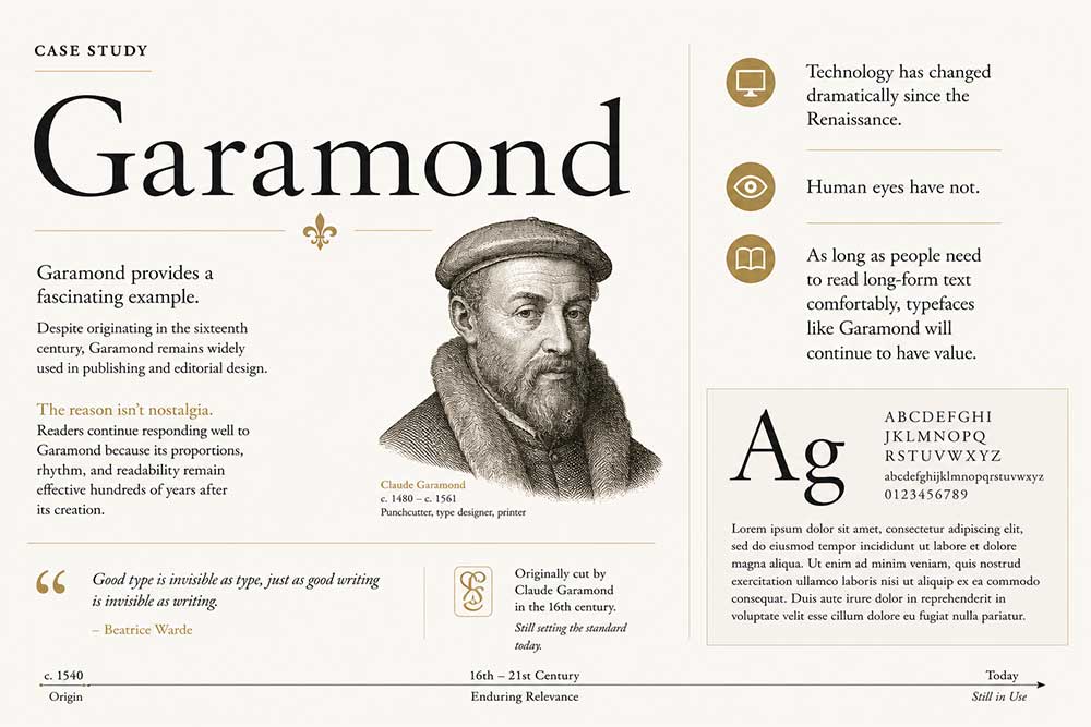
Garamond provides a fascinating example.
Despite originating in the sixteenth century, Garamond remains widely used in publishing and editorial design.
The reason isn’t nostalgia.
Readers continue responding well to Garamond because its proportions, rhythm, and readability remain effective hundreds of years after its creation.
Technology has changed dramatically since the Renaissance.
Human eyes have not.
As long as people need to read long-form text comfortably, typefaces like Garamond will continue to have value.
Font Garamond
Adaptability Is a Powerful Advantage
Many fonts become obsolete because they are too specialized.
A typeface designed for a very specific visual trend or niche purpose may perform exceptionally well in one context but struggle elsewhere.
Timeless fonts tend to be adaptable.
They work across:
- Print design
- Digital products
- Editorial layouts
- Branding systems
- Signage
- Packaging
- Advertising

The more situations a typeface can handle successfully, the greater its chances of surviving future changes in design culture.
Case Study: Futura
Few typefaces demonstrate adaptability better than Futura.
Originally released in 1927, Futura emerged from modernist design principles and geometric simplicity.
Nearly a century later, it still feels surprisingly contemporary.
Why?
Because its geometric structure allows it to fit into a wide range of applications.

Futura has appeared in corporate branding, magazine design, advertising campaigns, product packaging, and even aerospace communication.
Rather than belonging to a single era, it continues to find new roles in changing environments.
Personality Matters—But So Does Restraint
Many designers assume that memorable fonts need strong personalities.
While personality is important, timeless typefaces often succeed because they balance character with restraint.
A font that is too neutral can become forgettable.
A font that is too expressive can become dated.
The most enduring typefaces often sit somewhere in between.
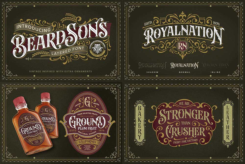
Beardsons by Arterfak Project — a best seller since 2021
They possess enough individuality to be recognizable but avoid exaggerated features that tie them to a specific trend.
Case Study: Frutiger
Designed by Adrian Frutiger, Frutiger is widely regarded as one of the most successful humanist sans-serif typefaces ever created.
It has personality.
The letterforms feel approachable, human, and welcoming.
Yet those qualities are carefully controlled.
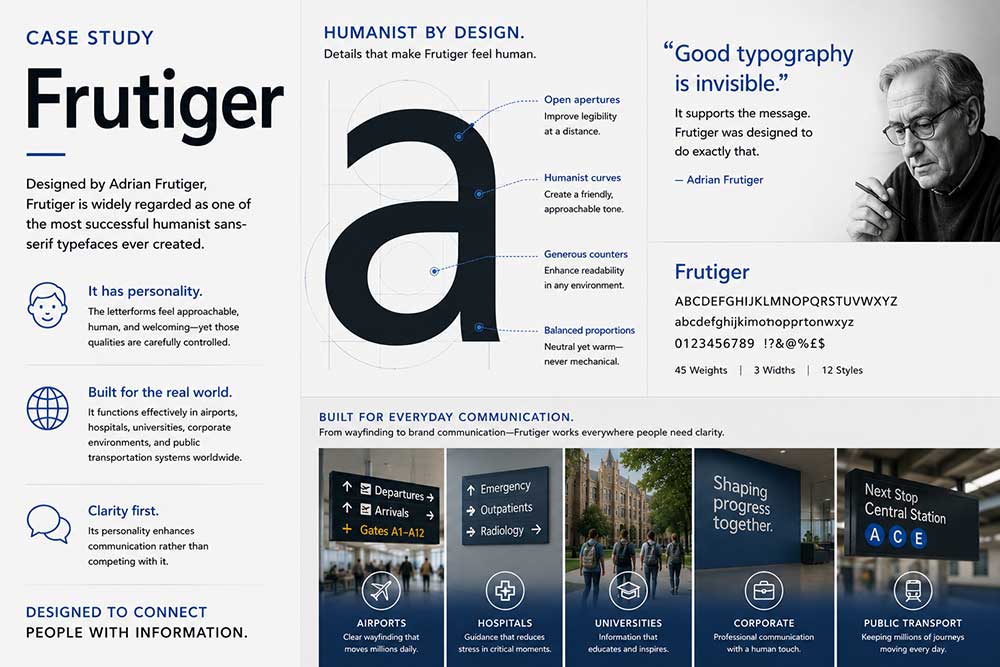
Frutiger never feels trendy or overly stylized.
This balance allows it to function effectively in airports, hospitals, universities, corporate environments, and public transportation systems around the world.
Its personality enhances communication rather than competing with it.
Great Craftsmanship Ages Better Than Great Ideas
A clever concept can attract attention.
Craftsmanship creates longevity.
Some fonts are remembered because they introduced an interesting idea. Others remain relevant because every detail was refined with exceptional care.
Spacing, kerning, weight distribution, optical balance, and consistency all contribute to how a typeface feels in real-world use.
Most users cannot identify these details individually.
However, they immediately notice the overall experience.
Fonts that feel comfortable, reliable, and effortless often remain useful far longer than those built around a single visual gimmick.
Case Study: Interstate
Interstate is a strong example of craftsmanship-driven success.
Inspired by American highway signage, Interstate transformed functional letterforms into a versatile typeface suitable for modern design.
Its success wasn’t based on trendiness.
Instead, it came from careful execution.
More than thirty years after its release, Interstate continues to appear in branding, editorial design, transportation systems, and digital interfaces because it performs consistently well across multiple contexts.
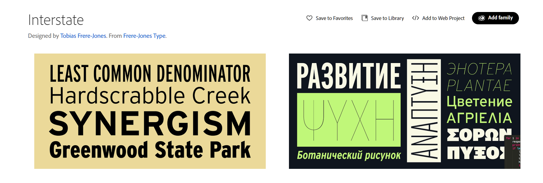
Font Interstate
Why Some Fonts Become Trapped in Their Era
Not every outdated-looking font is poorly designed.
In fact, some fonts become victims of their own success.
When a typeface becomes strongly associated with a specific period, trend, or cultural movement, it can be difficult for future audiences to separate the font from that context.
This is why certain fonts instantly evoke memories of a particular decade.
Many futuristic fonts from the early 2000s were designed to represent the future.
Ironically, they now represent the past.
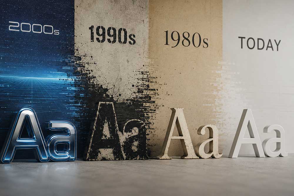
Similarly, some grunge-inspired typefaces became visual symbols of 1990s design culture.
Their identities became inseparable from the era that popularized them.
This doesn’t make them bad fonts. It simply limits their ability to feel timeless.
The Real Test of a Typeface
A typeface doesn’t become timeless on launch day.
Timelessness is earned. The true test occurs years later when designers still choose the font despite having thousands of alternatives available. Helvetica continues to compete against newer sans-serifs. Garamond remains relevant despite centuries of typographic evolution. Futura survives despite countless geometric typefaces that followed. Their longevity suggests an important truth: The most enduring fonts are rarely the most fashionable.
They are usually the most useful.
Conclusion
The reason some fonts age better than others has very little to do with luck.
Timeless typefaces share common qualities: strong fundamentals, adaptability, balanced personality, exceptional craftsmanship, and a commitment to communication over trendiness.
While no designer can predict which modern fonts will still be used fifty years from now, history provides a clear pattern.
Fonts that prioritize readability, flexibility, and thoughtful design consistently outperform those built around temporary visual trends.
In the end, timeless typography isn’t about looking modern forever.
It’s about remaining valuable long after the definition of modern has changed.